Gusto!Khrusto
01 Objective
Gusto Khrusto (Густо!Хрусто) is a waffle candy with a special taste.
Sweets are notable for their unique combination of thick filling and crispy waffles. This feature is reflected in the title. We were supposed to create a primary and secondary packaging of crispy sweets.
02 Packaging Concepts
In Italian, the word gusto means taste, pleasure. And the name Gusto Khrusto sounds somehow Italian as well. That’s why the first concept we suggested was based on this association.
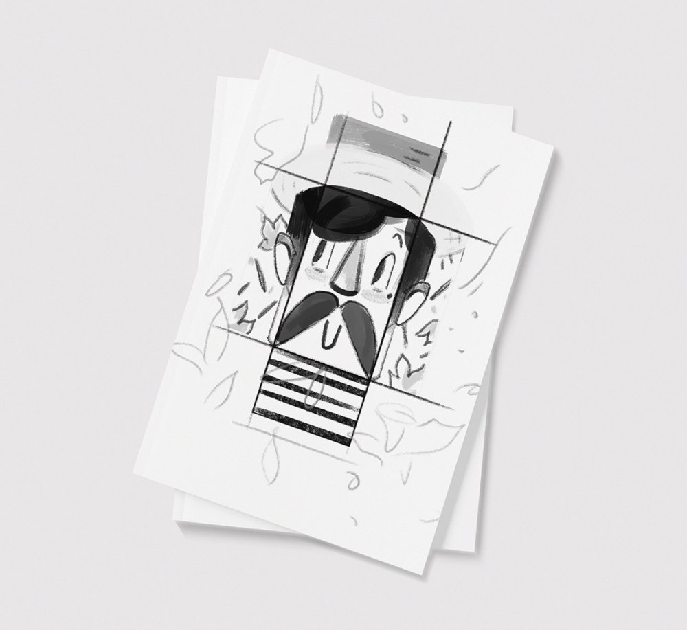
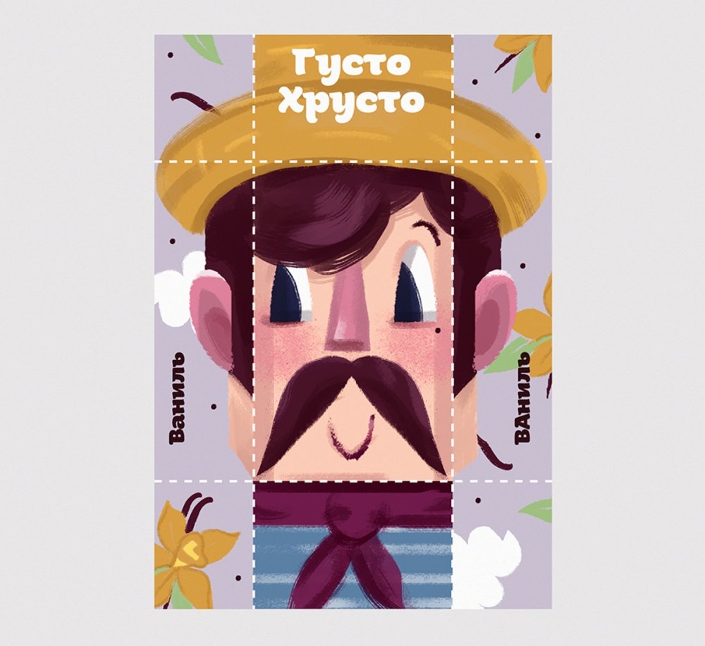
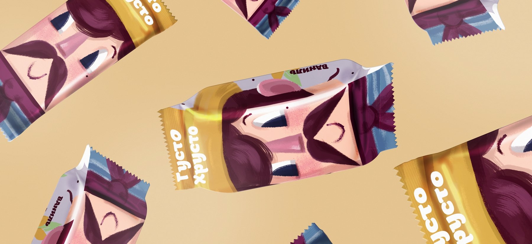
Packaging of each of the tastes represents a resident of different parts of the "Mediterranean boot". Vanilla symbolizes Venice, Tiramisu associates with Rome and so on.
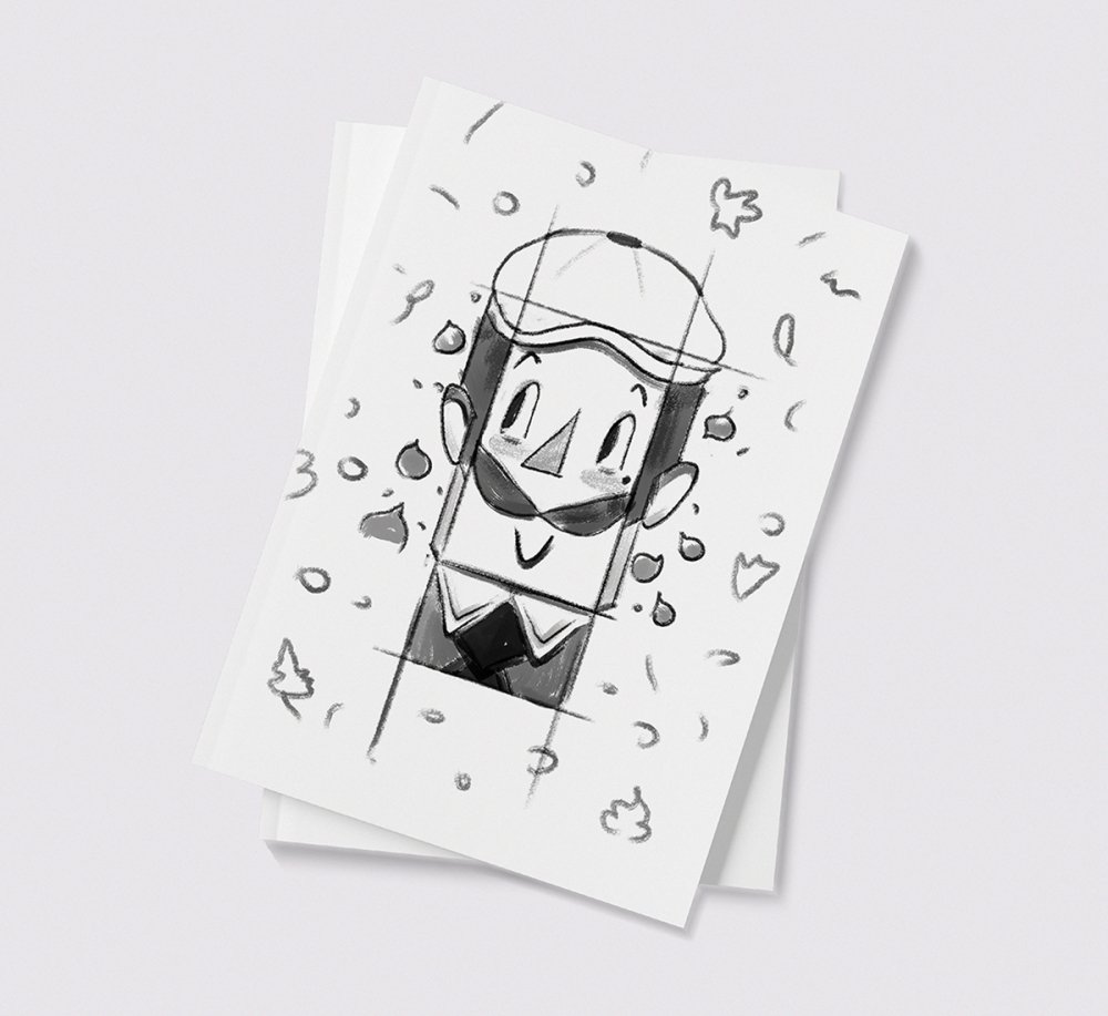
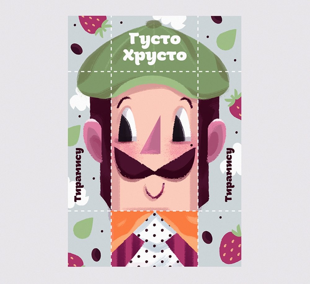
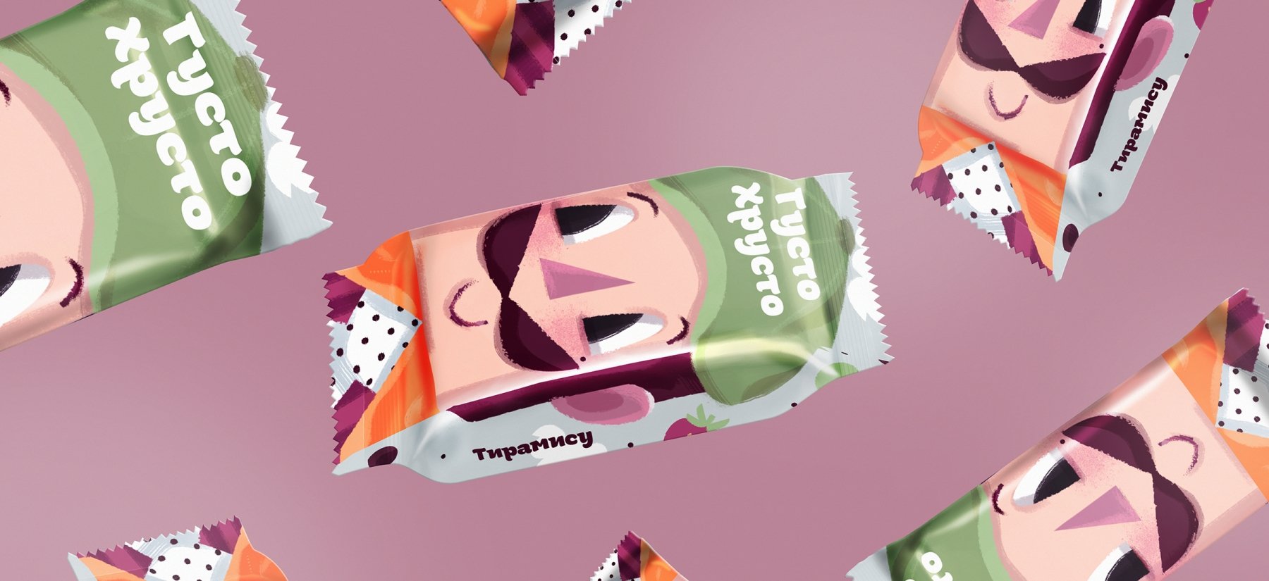
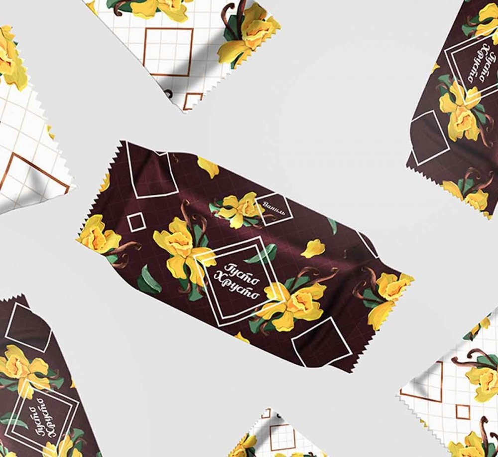
The second concept is based on light, bright and "delicious" patterns.
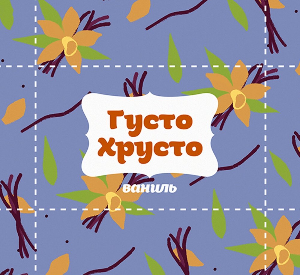
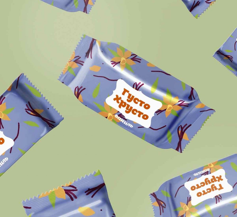
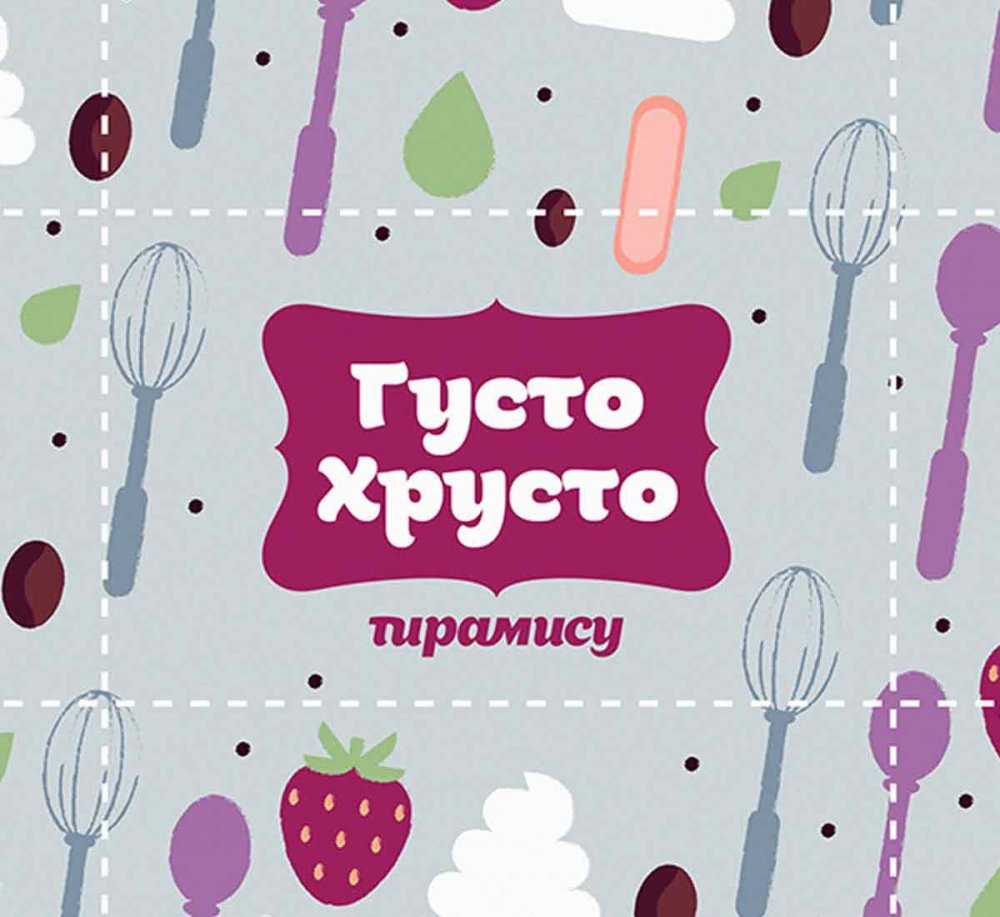
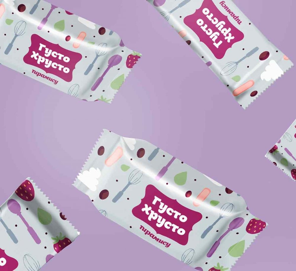
The third concept is a classic and realistic illustration together with the associative style forming "waffle" pattern.
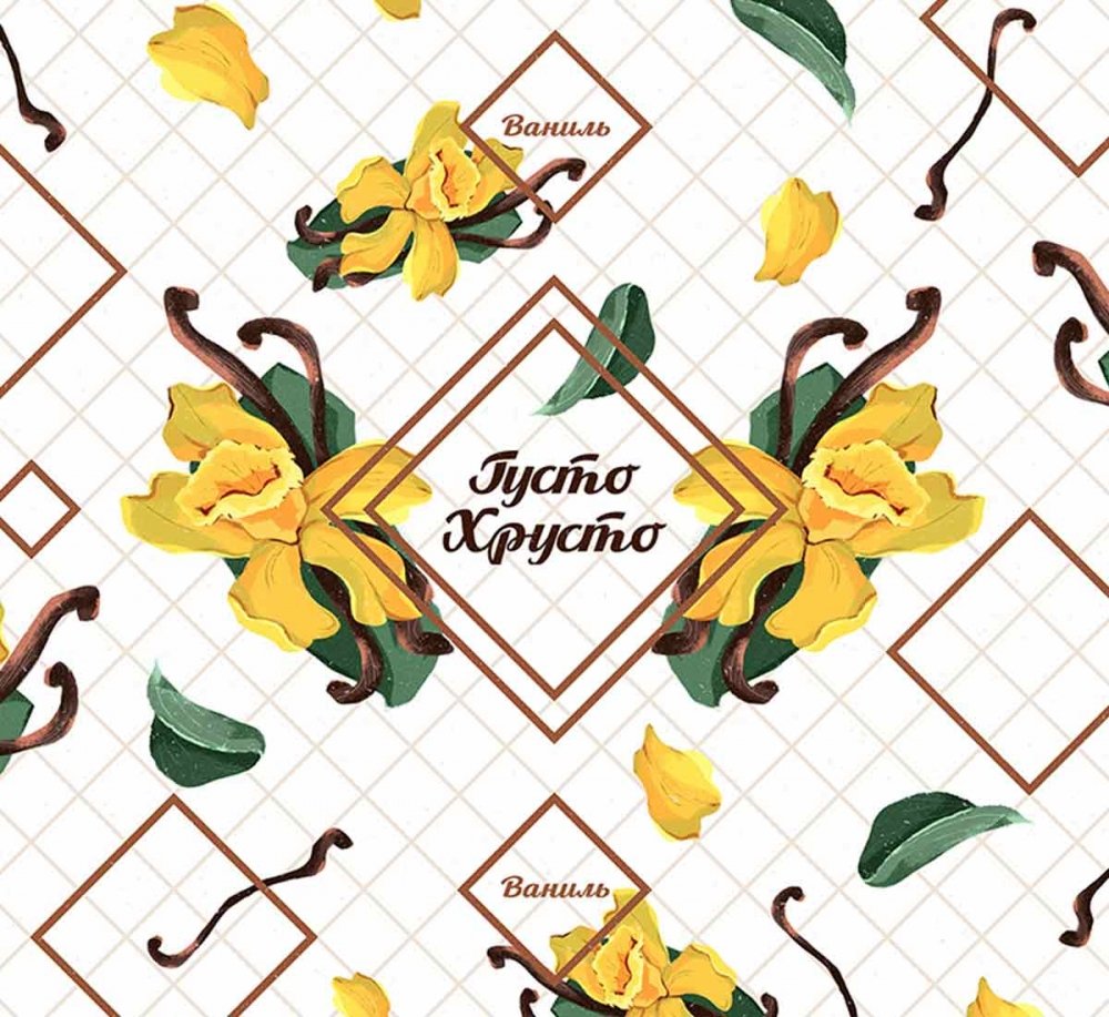
03 03 Final Design of the Primary Packaging
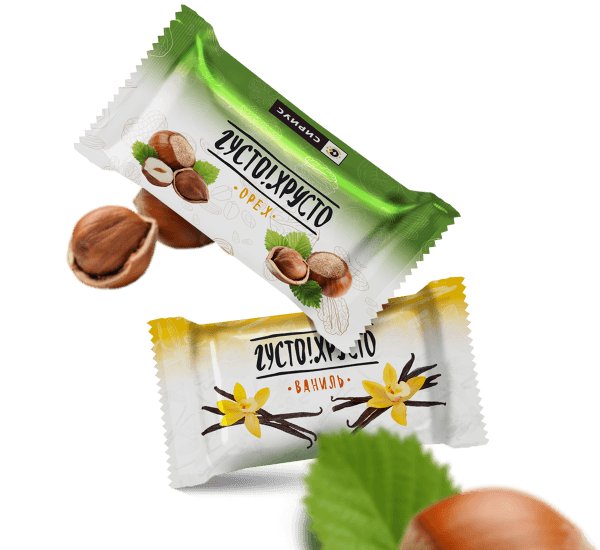
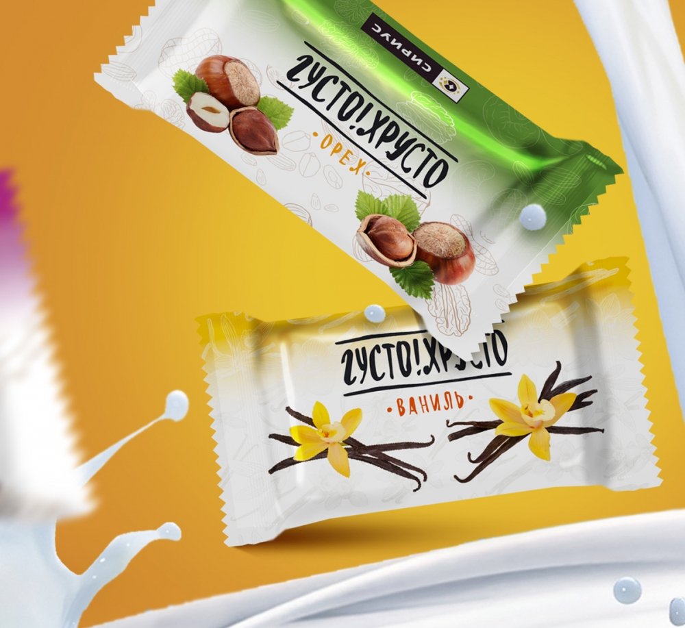
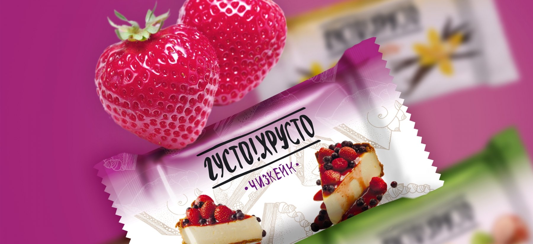
The selected variant of packaging is a combination of correspondent typography, appetizing images, juicy colors and background illustrations.
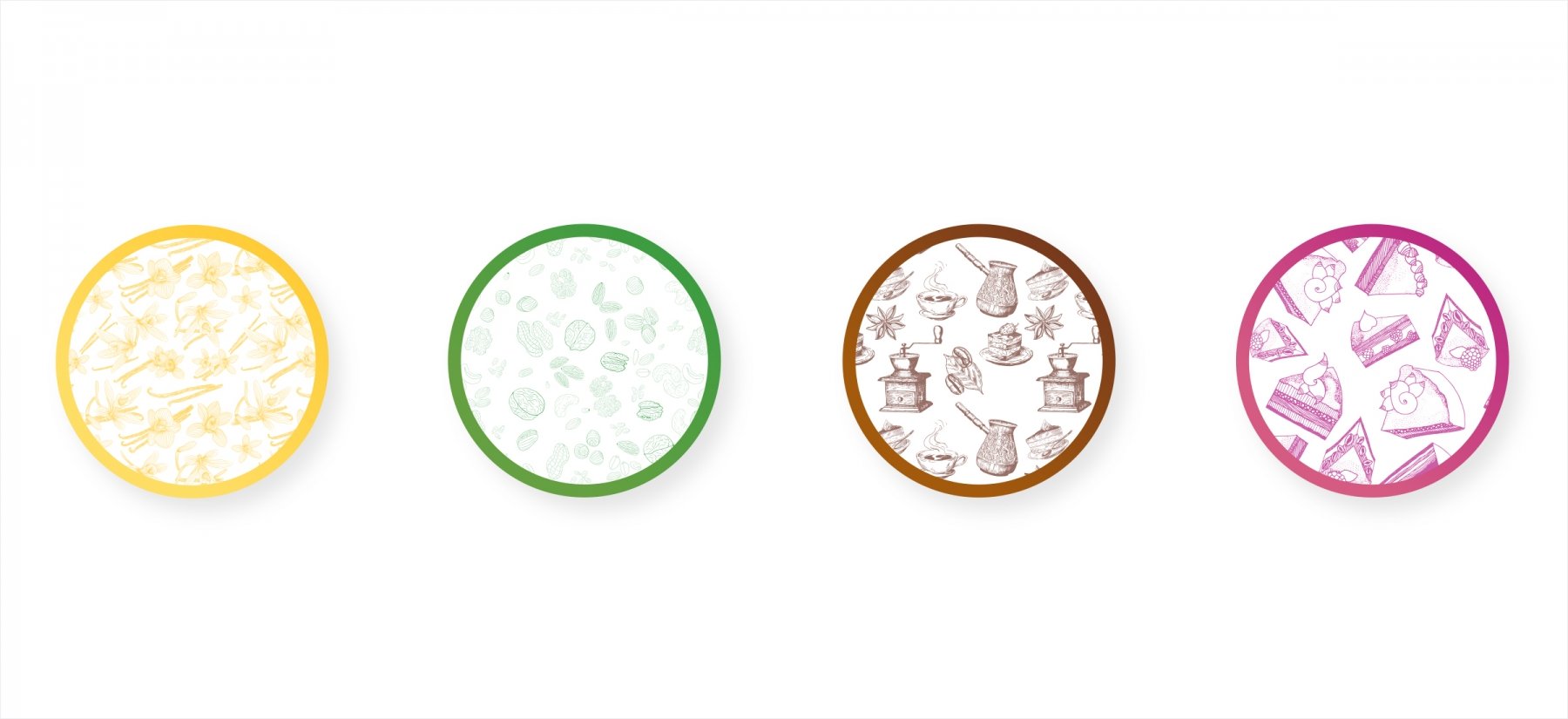
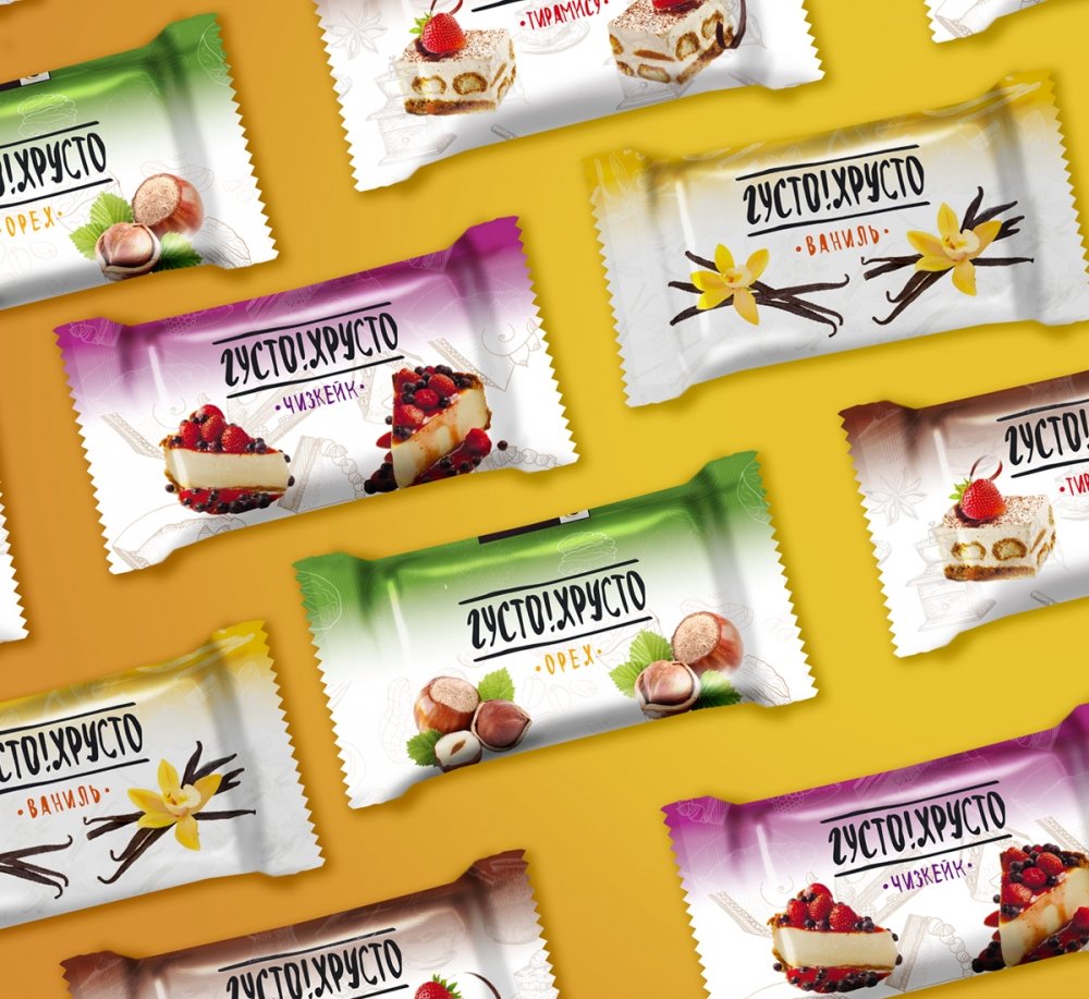
The candy logo resembles the patterns of chocolate glaze. The exclamation mark forms the symmetry, provides recognition, attracts attention and adds natural emotionality. Each taste has its own distinctive color. The hazelnut is decorated in green tones, which are associated with the green hazelnut leaf. Cheesecake has a purple keynote that corresponds to a berry cocktail.
Tiramisu taste is represented by brown chocolate crumbs, evolving into a layer of cream cheese with strawberries. The yellow tone conveys the aroma of flowering vanilla. The background pattern completes the framing of candy’s front part. Infographics tells about the natural ingredients and ecological compatibility of the product.
04 Secondary Packaging
The design of secondary packaging for federal chains is a logical continuation of bright colors and delicious images.
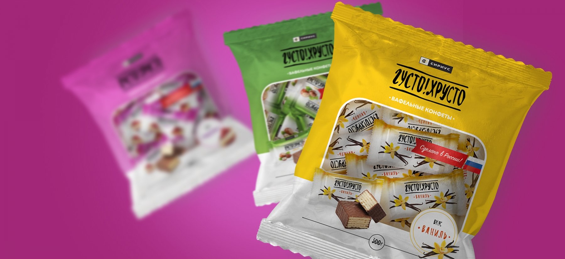
The design with the expressive colors, typography and characteristic patterns creates a vivid image for every taste. Once on the shelves, the sweets immediately began to enjoy great success among the customers.
