Logotype and Visual Identity

The shopping center "Yarmarka Krekshino" (Krekshino Fair) is a modern format of an eco-market selling vegetables and fruits, meat and fish, dairy products, cheeses, sausages, dried fruits and other products.
In 2019, in order to improve the quality of customer service, a complete renovation of the shopping center was carried out: reconstruction, improvement of service standards and rebranding. We were responsible for the branding.
It was important to create a visual perception of the brand, corresponding to the new look of the beloved fair of local residents, while maintaining the kind-hearted perception of regular visitors and creating interest among a new audience.
01 New Logotype
Initially, we developed several logo concepts.
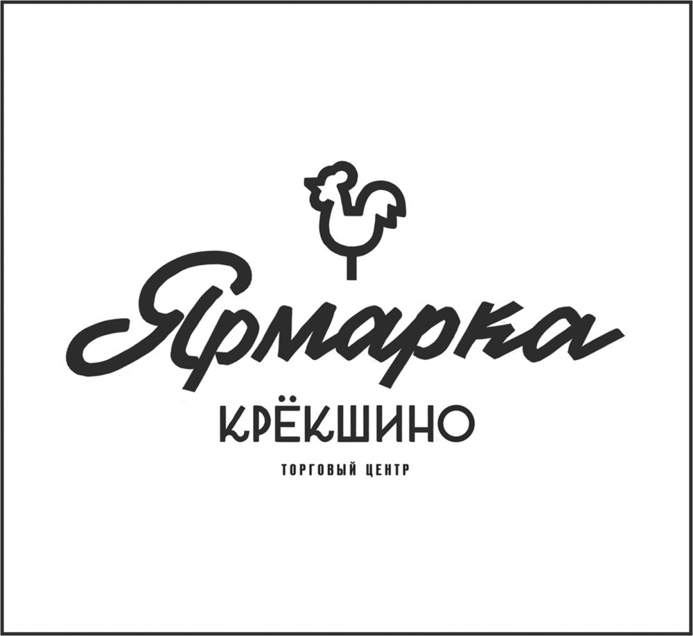
A fair in the history of Russia is not only shopping, but also a real holiday. Including children. For almost 500 years, no fair has been complete without the famous lollipop - cockerel on a stick.
In addition, it is a symbol of home, comfort and a small miracle, familiar to all adults. Grandmothers and mothers in Russia made us happy with welcome candies on special occasions. We developed the first concept with this symbol.
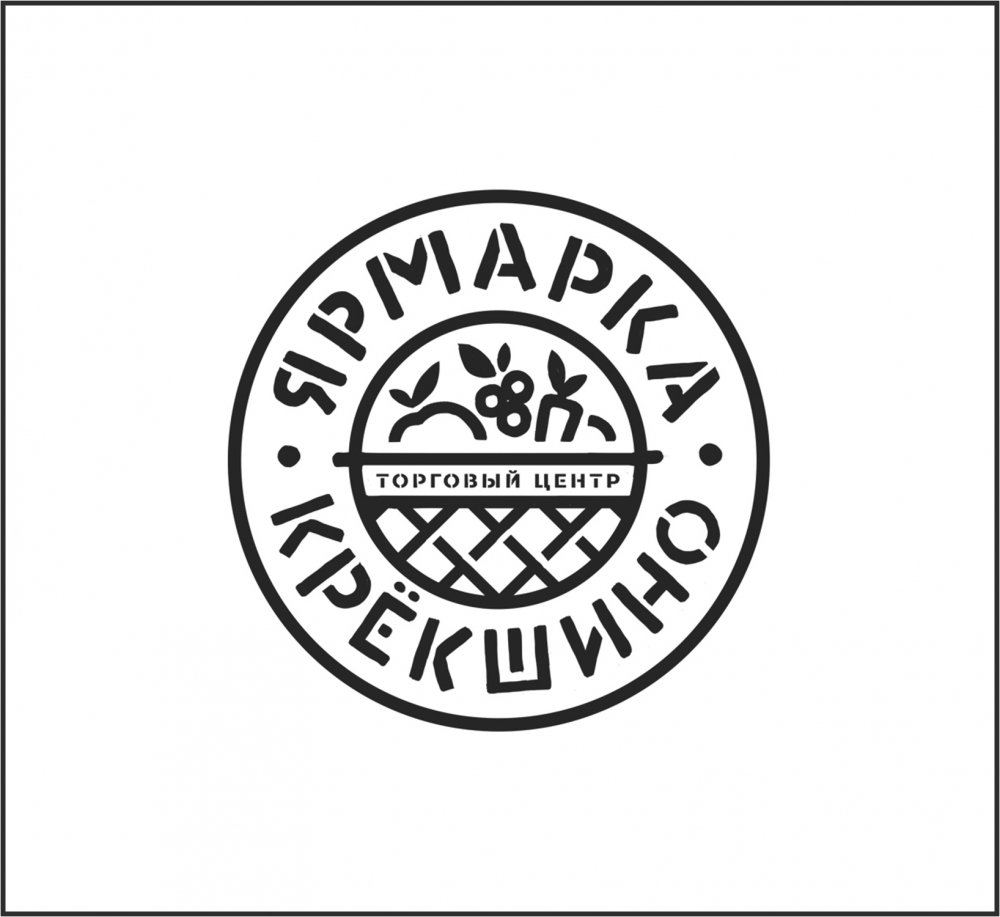
In the second concept, the logo has three key features:
1. It shows a shopping cart full of fresh vegetables that create a sense of naturalness and abundance
2. A stencil font that creates an association with farm products
3. The shape of the logo is a circle, which is a symbol of the sun
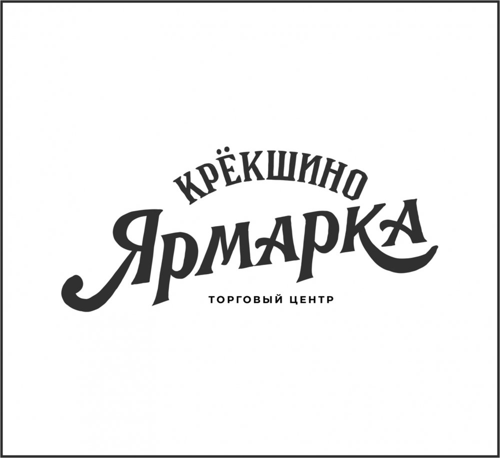
The third concept is based on a font solution. The typography is inspired by lettering from the Tsarist era.
The fourth concept combines Slavic writing and images of the fair's assortment.
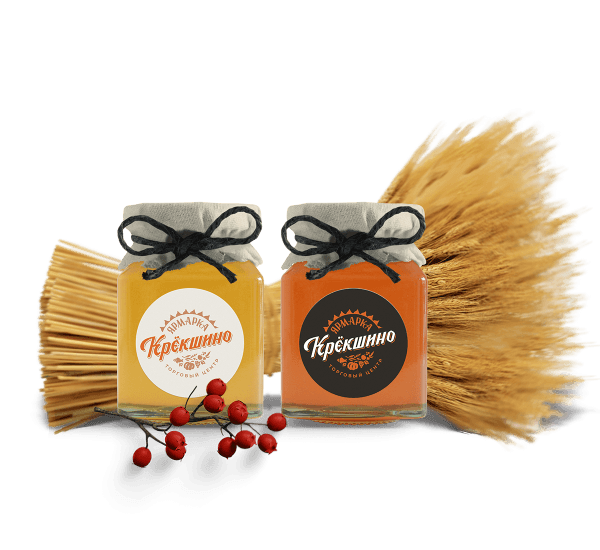
An important wish of the customer was the preservation of the sun in the symbolic part. Therefore, we added sun rays to the selected option.
02 Visual Identity
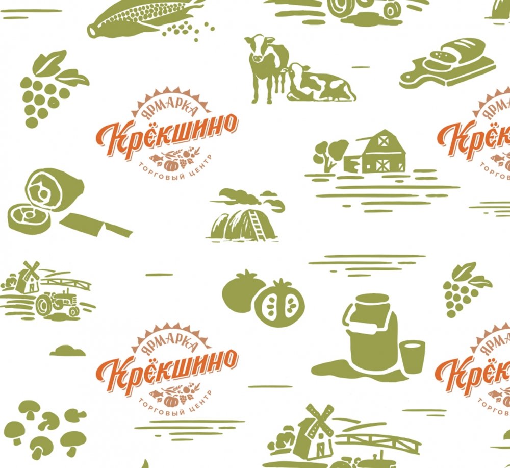
We have developed several variants of the pattern. All images are drawn from scratch, without using ready-made images from stocks. Natural colors create an association with the organic products that are sold at the fair.
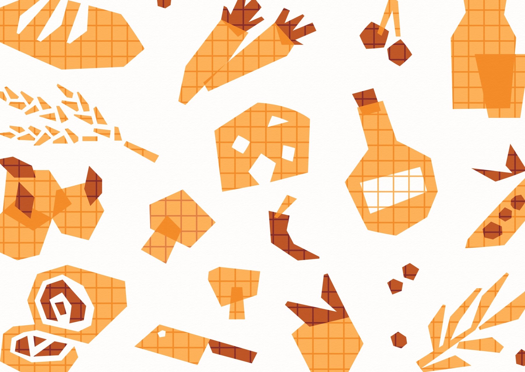
The client chose a more geometric and abstract pattern. Thematic drawings are reminiscent of school times, when we drew in class in workbooks.
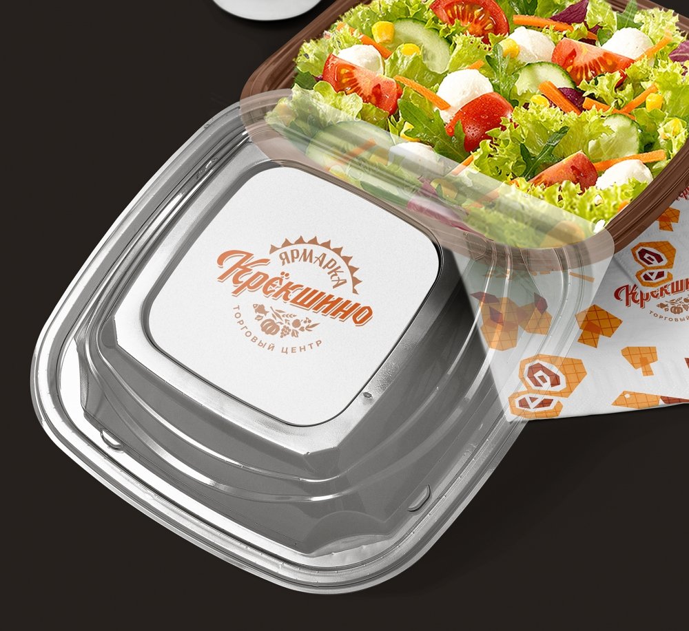
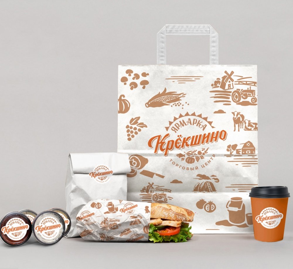
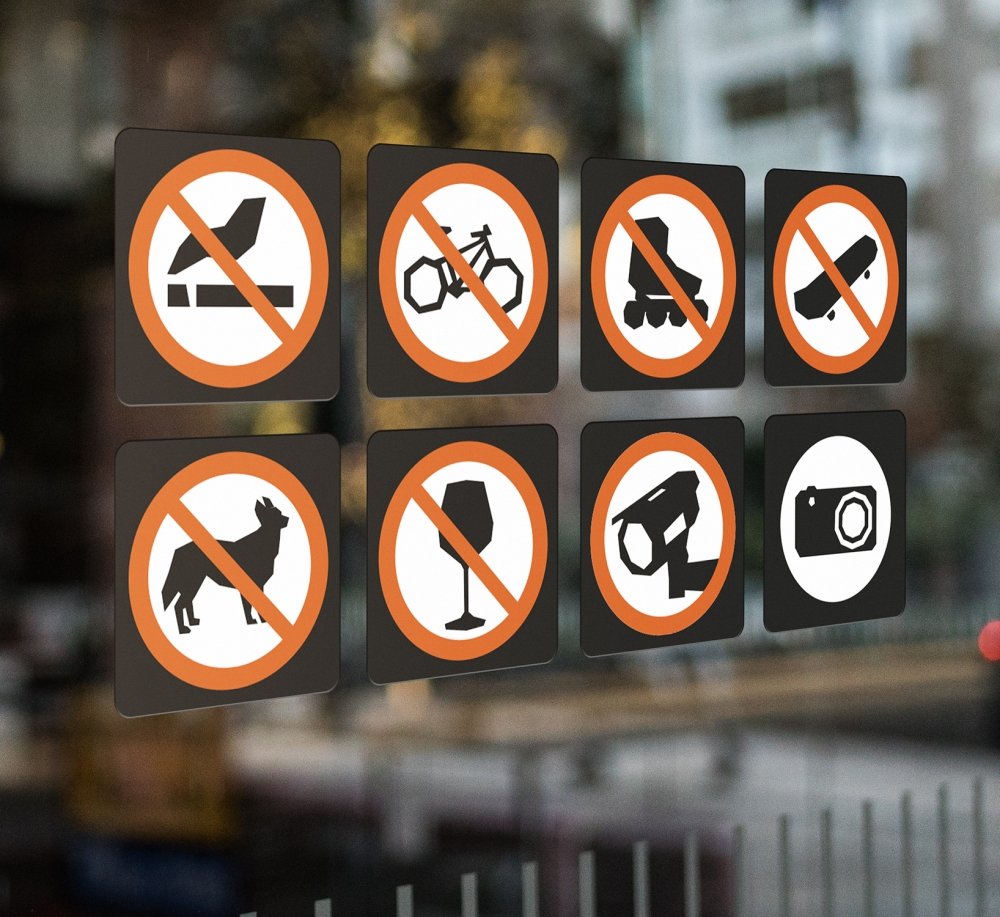
Based on the constants of the corporate identity, we have developed the design of packages, forms, price tags, plates, prohibition signs, etc.
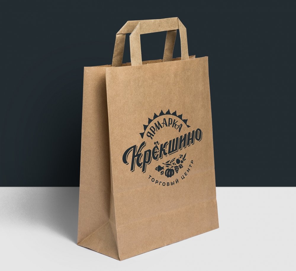
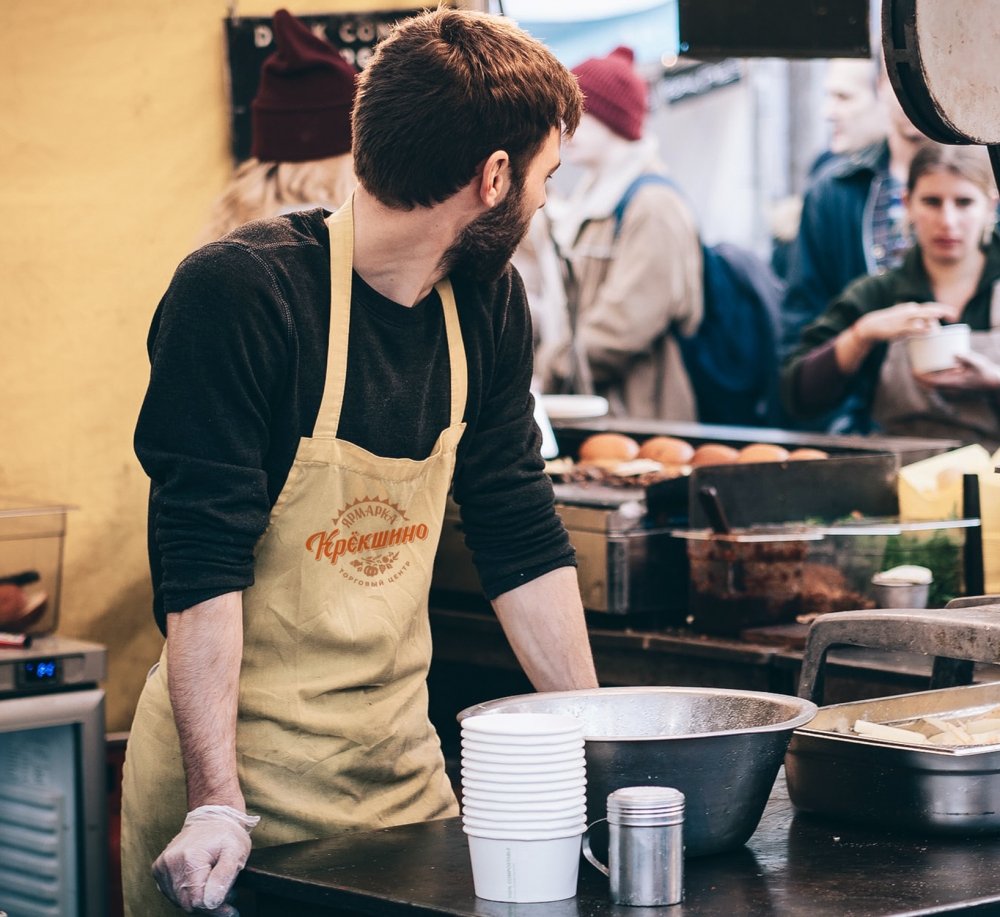
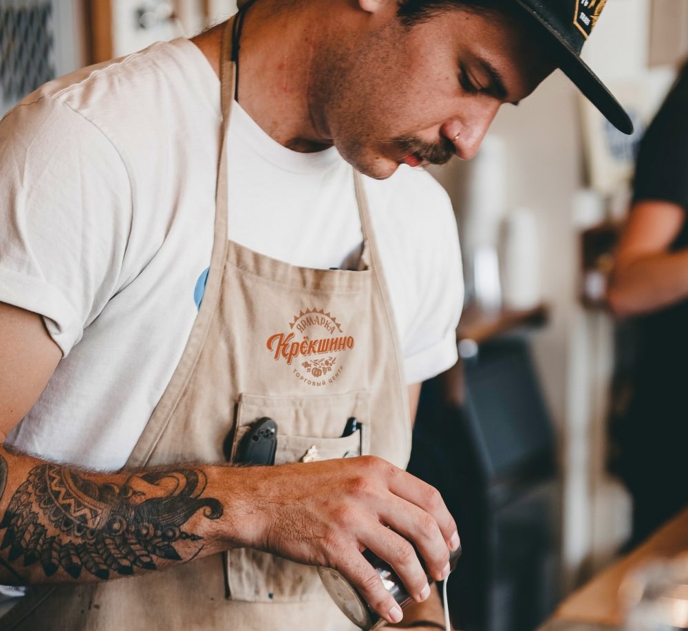
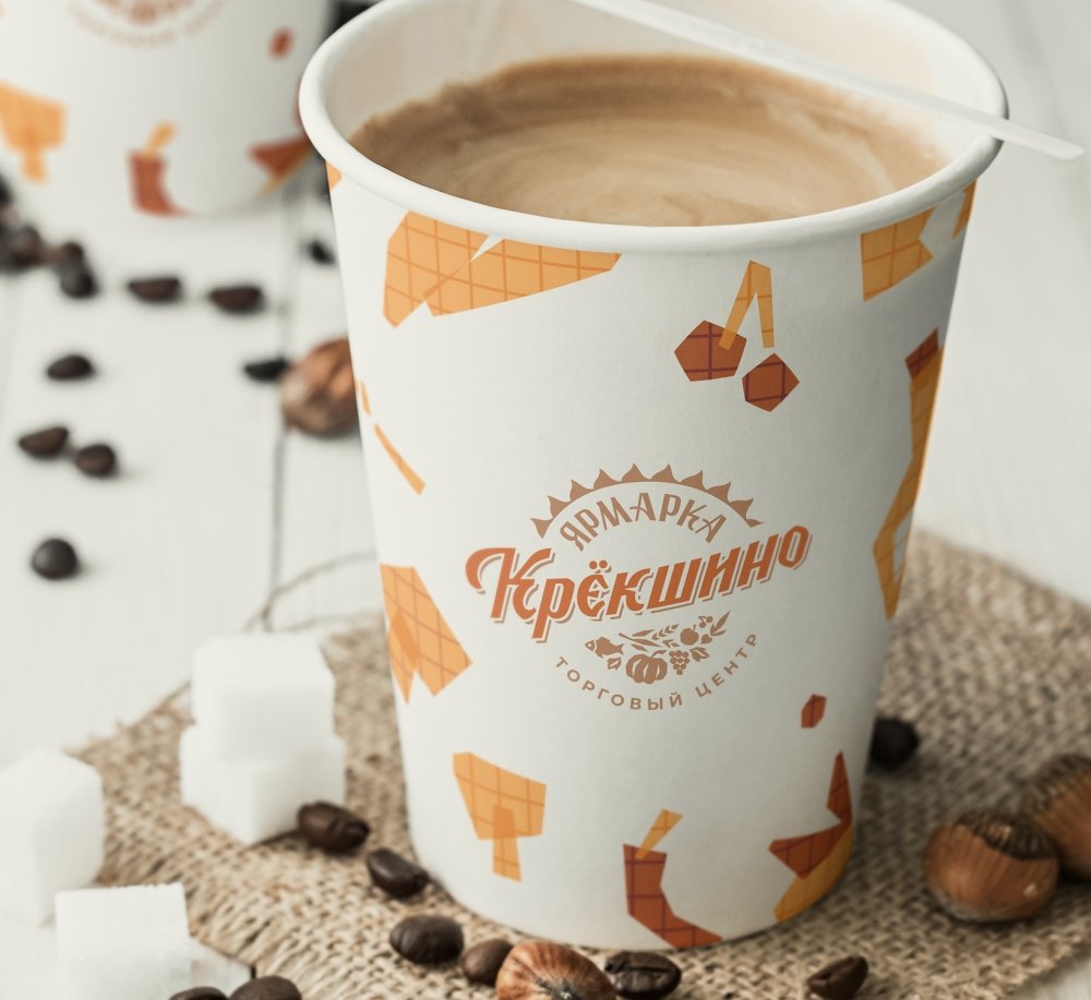
The design of corporate media and advertising layouts conveys a sense of naturalness and freshness. Helps fair employees create a homely and kind atmosphere.
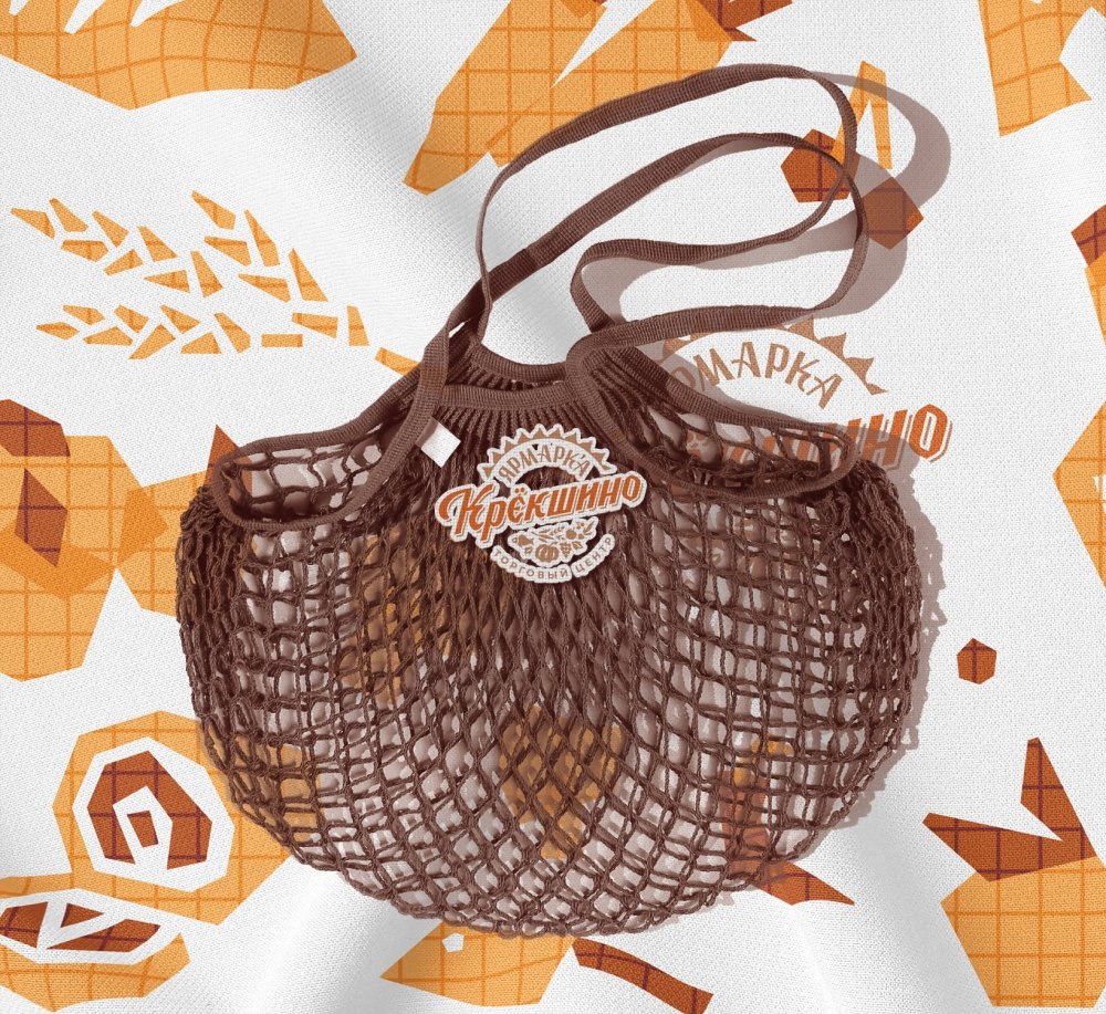
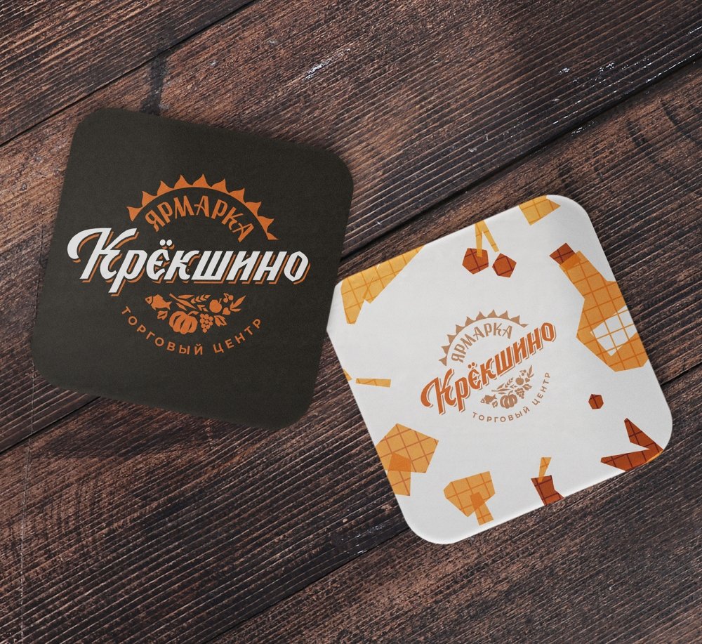
The corporate pattern is actively used in the visual communication of the brand. The pictograms are made in the style of the logo elements.
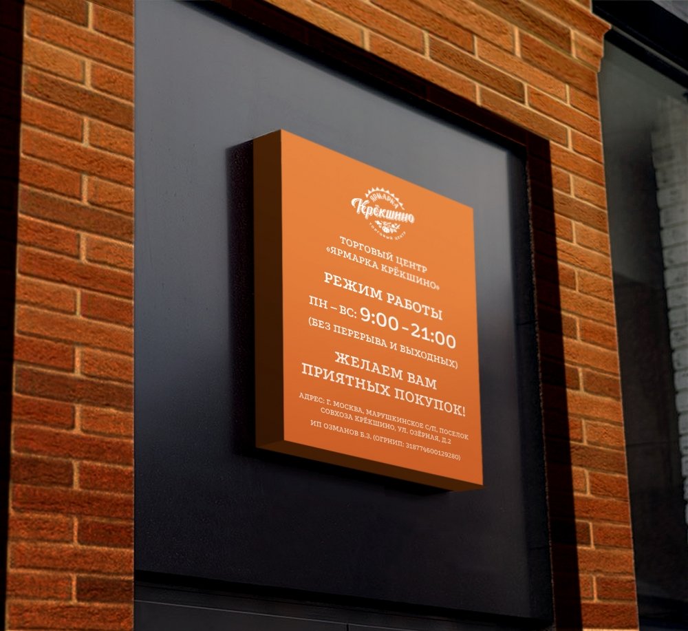
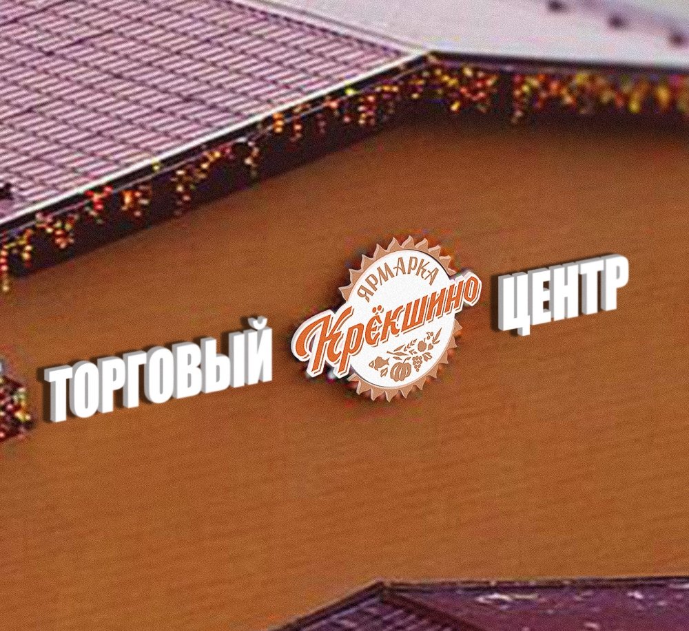
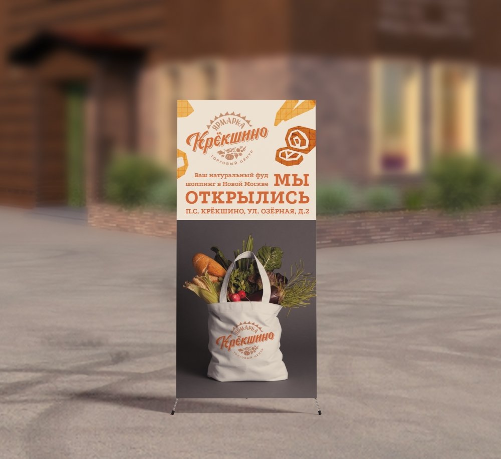
The shopping center "Yarmarka Krekshino" is open for connoisseurs of natural products, fresh drinks, delicious dishes and vivid impressions!
