Hotel Rebranding

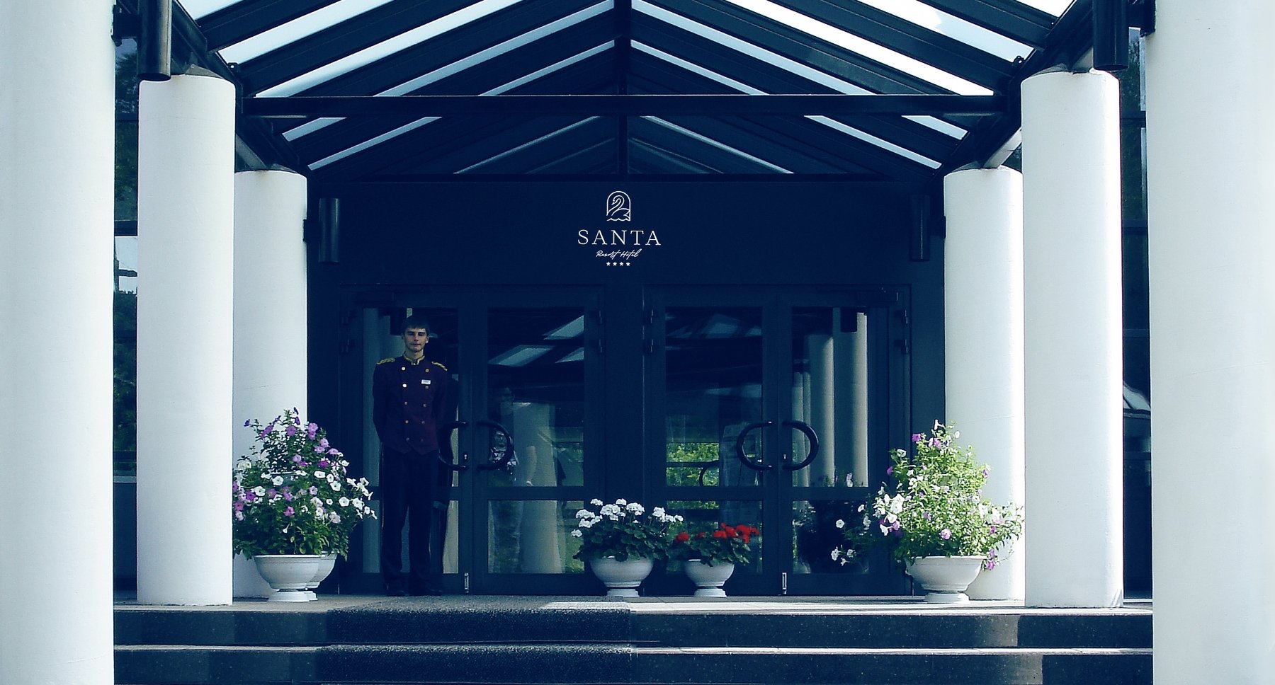
Santa Resort Hotel is a four-star eco-hotel located on Sakhalin Island. It was created in harmony with nature and in accordance with the values of oriental hospitality. For 20 years the hotel has been welcoming guests from all over the world.
01 New Logo
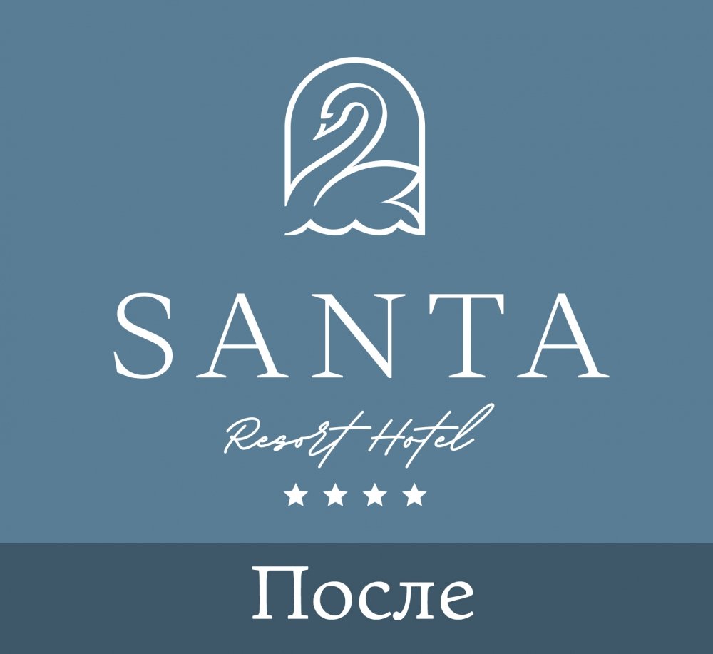
Our task was to make visual rebranding. To create a style that meets the high standards of service for guests and modern trends in the hotel business. This is the result of the performed rebranding:
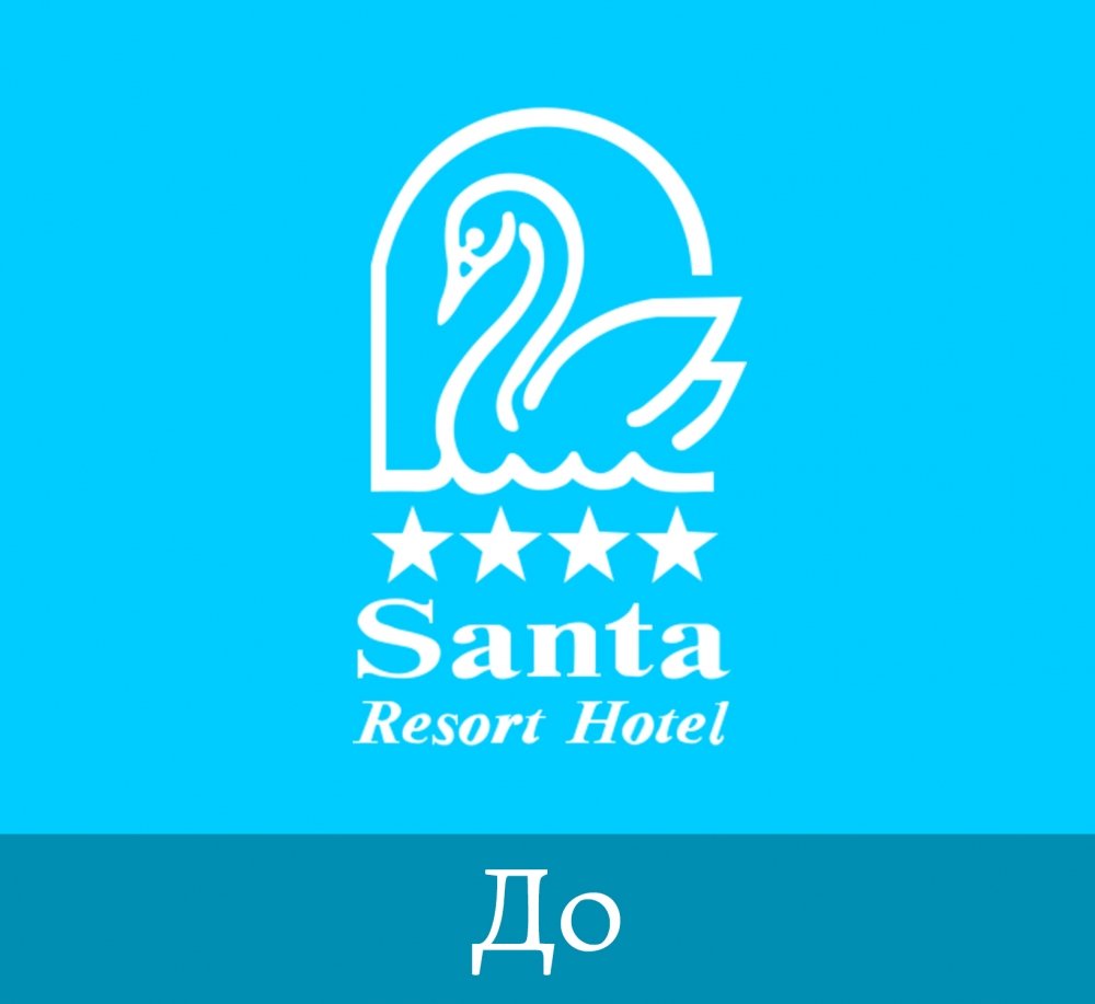
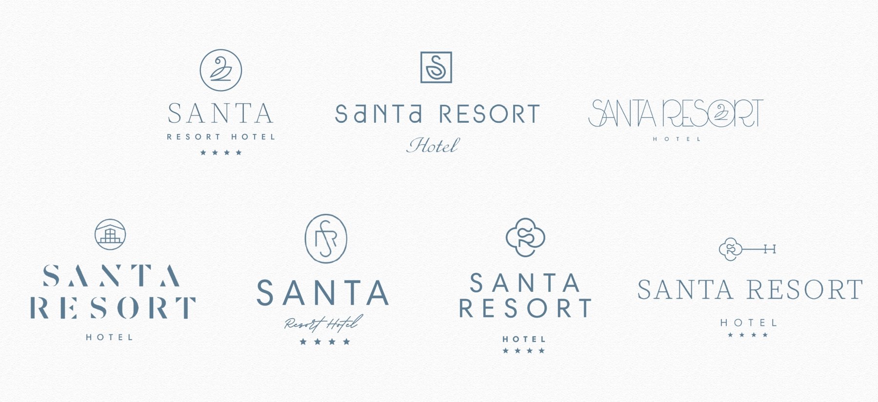
But we started by developing possible directions for the development of the new logo. In the first direction, we are rethinking the swan symbol in a more minimalistic way. Made it thinner, lighter. In the second, a memorable architectural solution of the Hotel was involved - the entrance group. It is supported by the spelling of the Hotel's name using airspace. The third direction is monogram. The symbol is implemented in several versions. One of them has a four-leaf clover. According to legend, it brings happiness to a finder. 4 leaves symbolize hope, faith, love and good luck. Also, this form has four directions: north, south, west, east. Which means the readiness to welcome guests from all over the world. In the final version, the SRH monogram is inscribed in the key symbol. The key from the Hotel rooms and hearts of Guests.
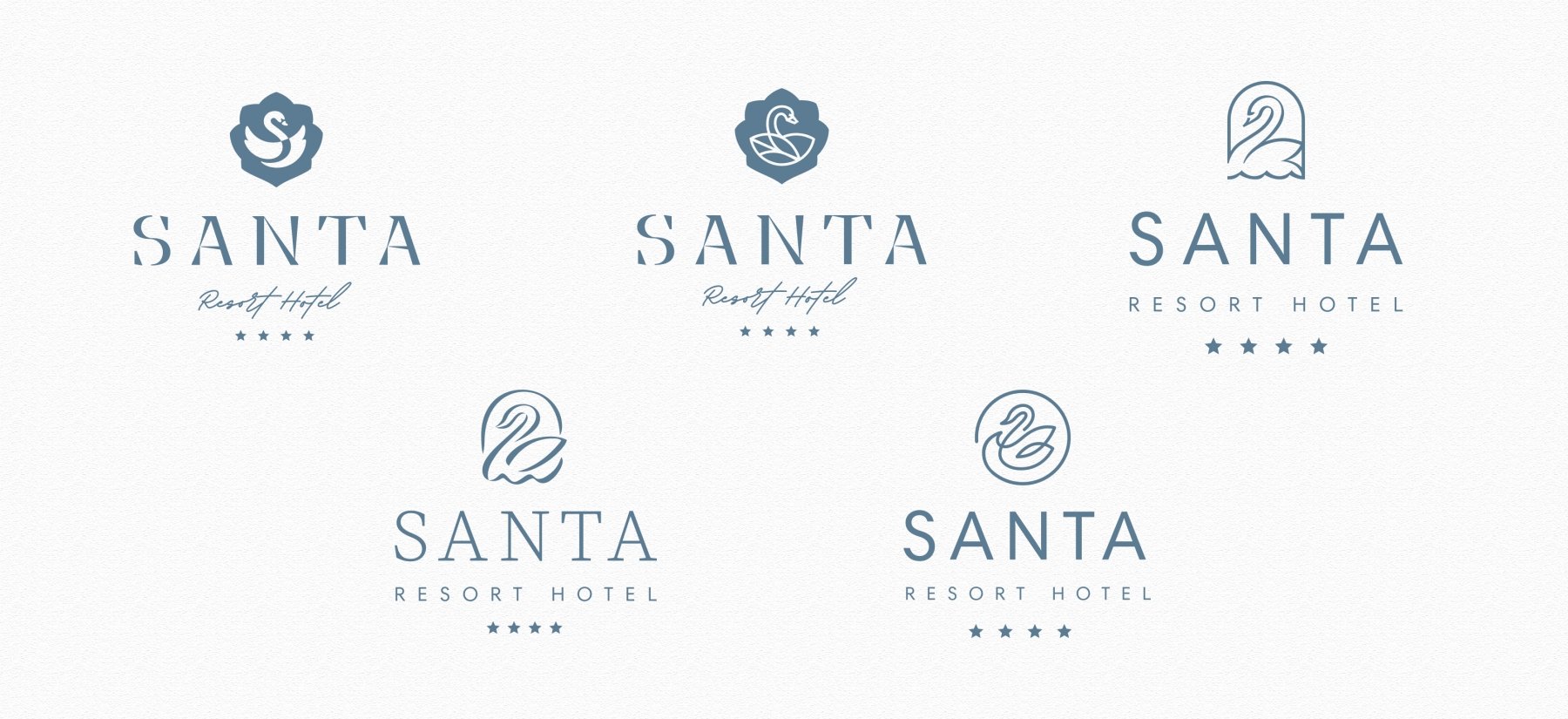
Our client chose the swan concept for development. We have prepared several options for its implementation.
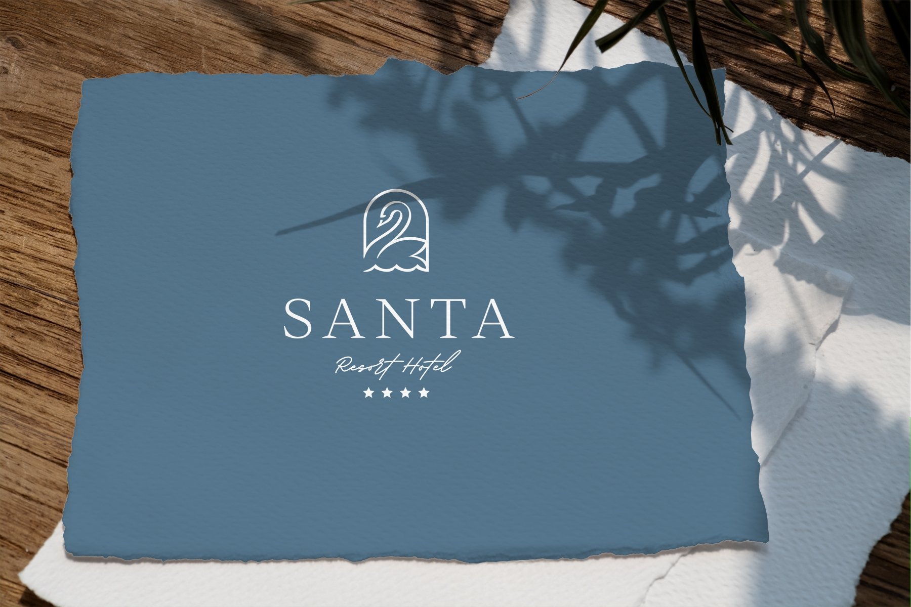
The final version of the logo is a graceful swan peacefully floating on the waves. Inscription SANTA is made in a strict, premium style. Resort Hotel's handwritten font conveys a personal touch to each hotel guest.
02 Brand Pattern
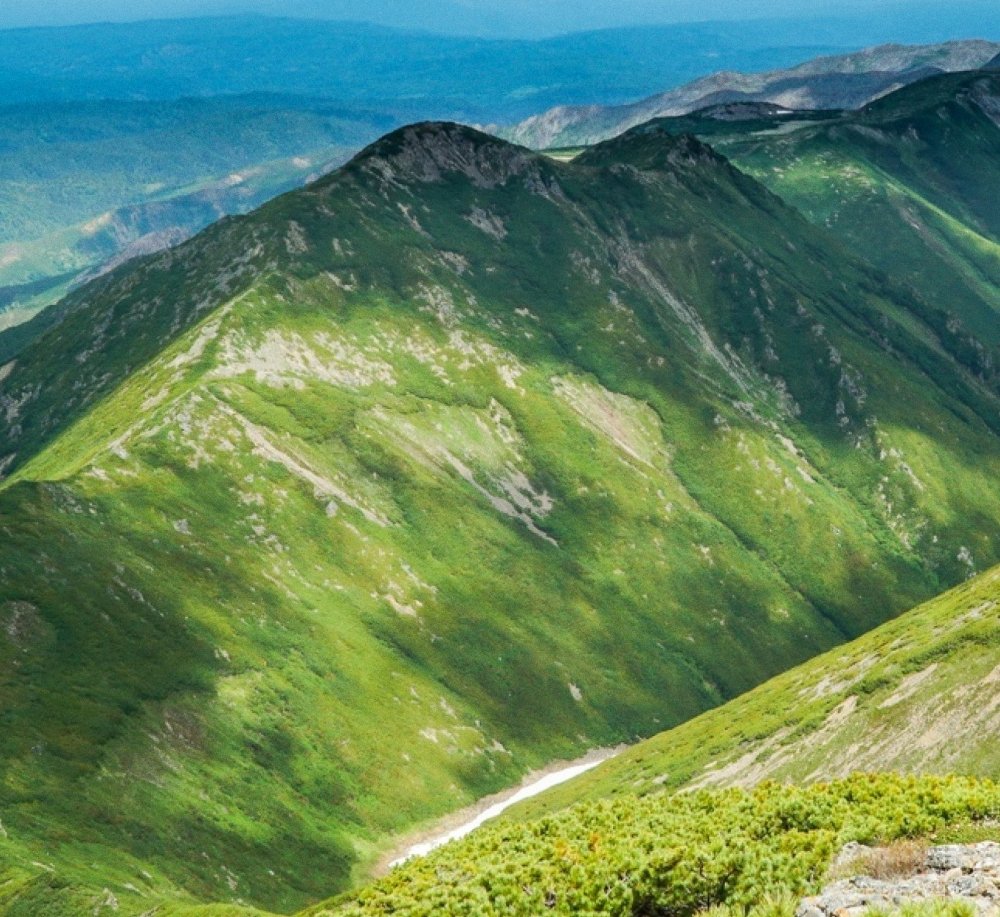
For the selected logo, we have developed several options for a supporting element - a corporate pattern. The picturesque landscapes of Sakhalin Island became the source of inspiration. The first option is a filling linear pattern that demonstrates the vast expanses of this area.



In the second version, lighter, smoother lines elegantly emphasize the logo. They seem to be its continuation.


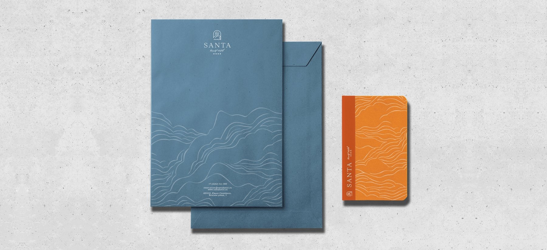
The third version of the pattern is made with dynamic lines and represents the diversity of Sakhalin nature. A rhythmic pattern reveals its liveliness.

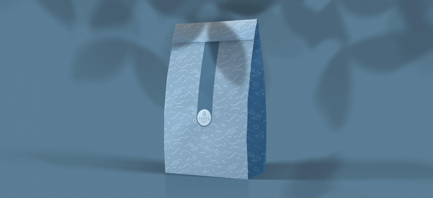
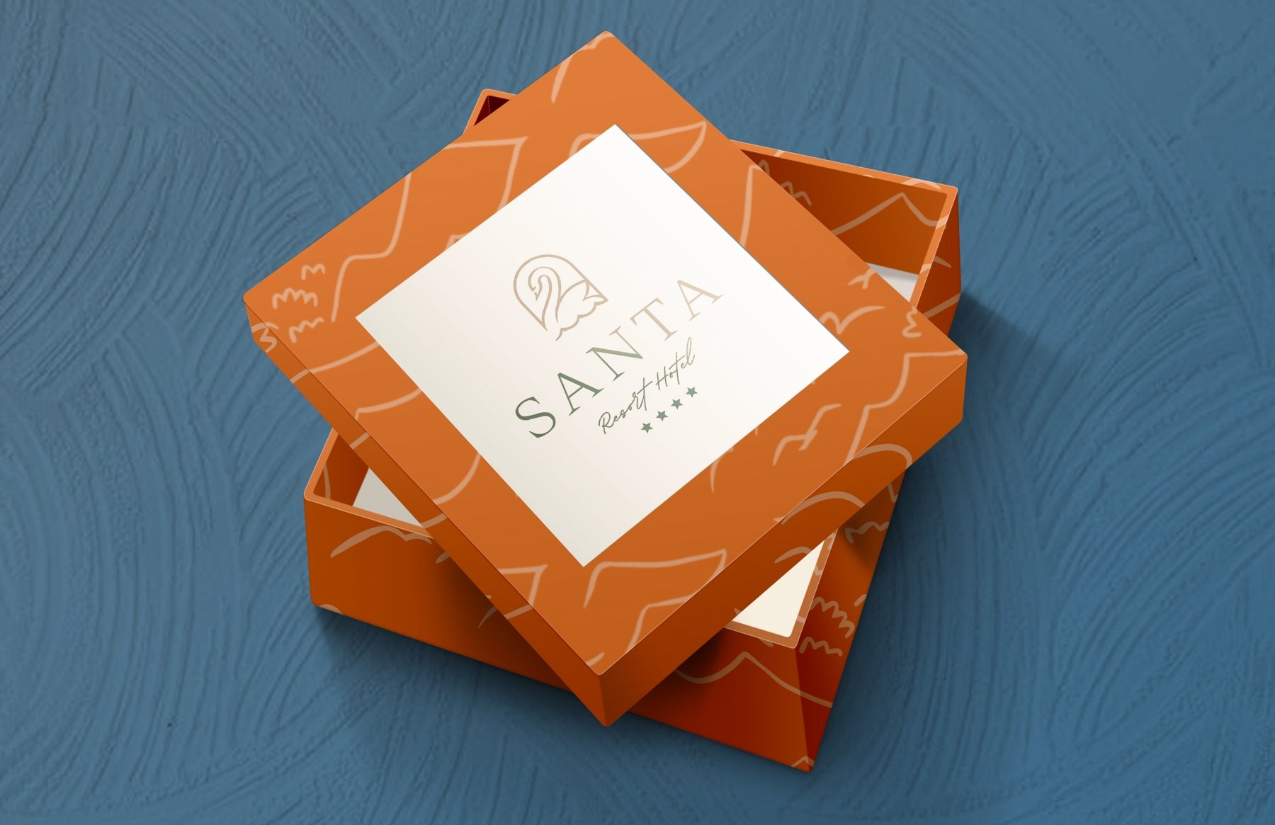
An alternative, more static option. Interleaving allows to add a more business-like look to the pattern without losing plasticity.

03 Selected Pattern
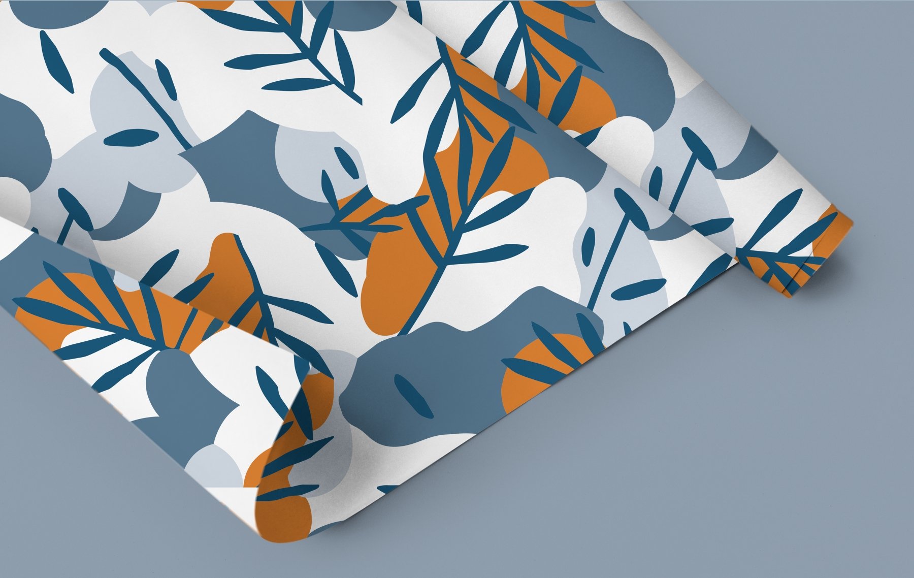
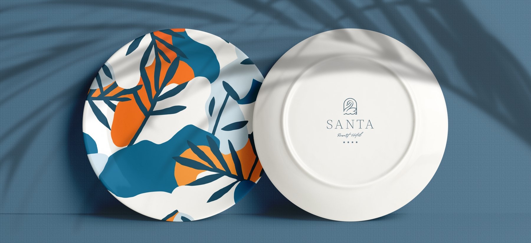
In search of a better option, we moved away from line drawing and tried spotting. The pattern of leaves and contrasting spots is stylishly combined with the logo, perfectly complementing and refreshing the hotel's appearance.




04 Visual Identity
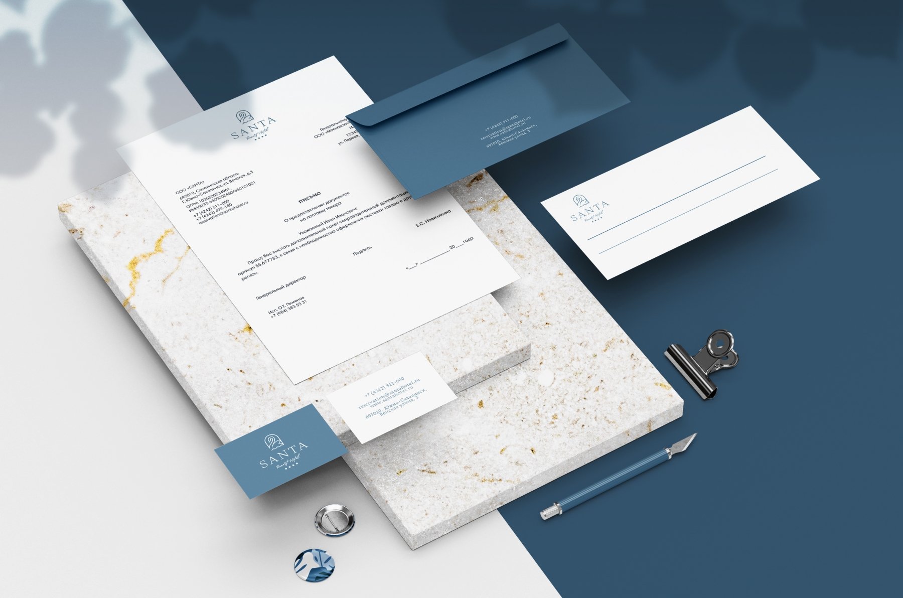
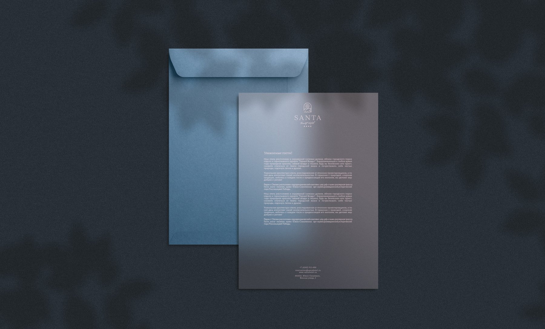
A soft but business-like dark blue color symbolizes the expanses of water and the endless sky of Sakhalin. It is close to the color used in the Coat of Arms of the Sakhalin Region. An additional color is natural orange. It adds emphasis and is useful for printing on premium materials (such as leather goods).
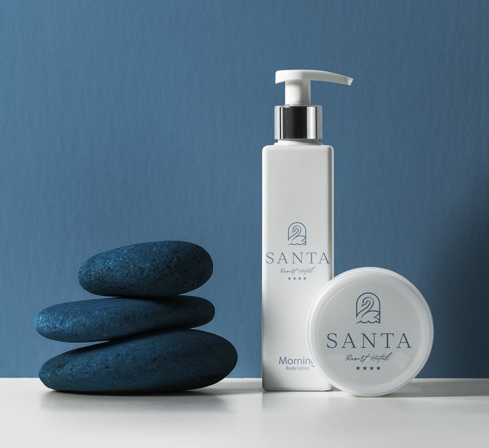
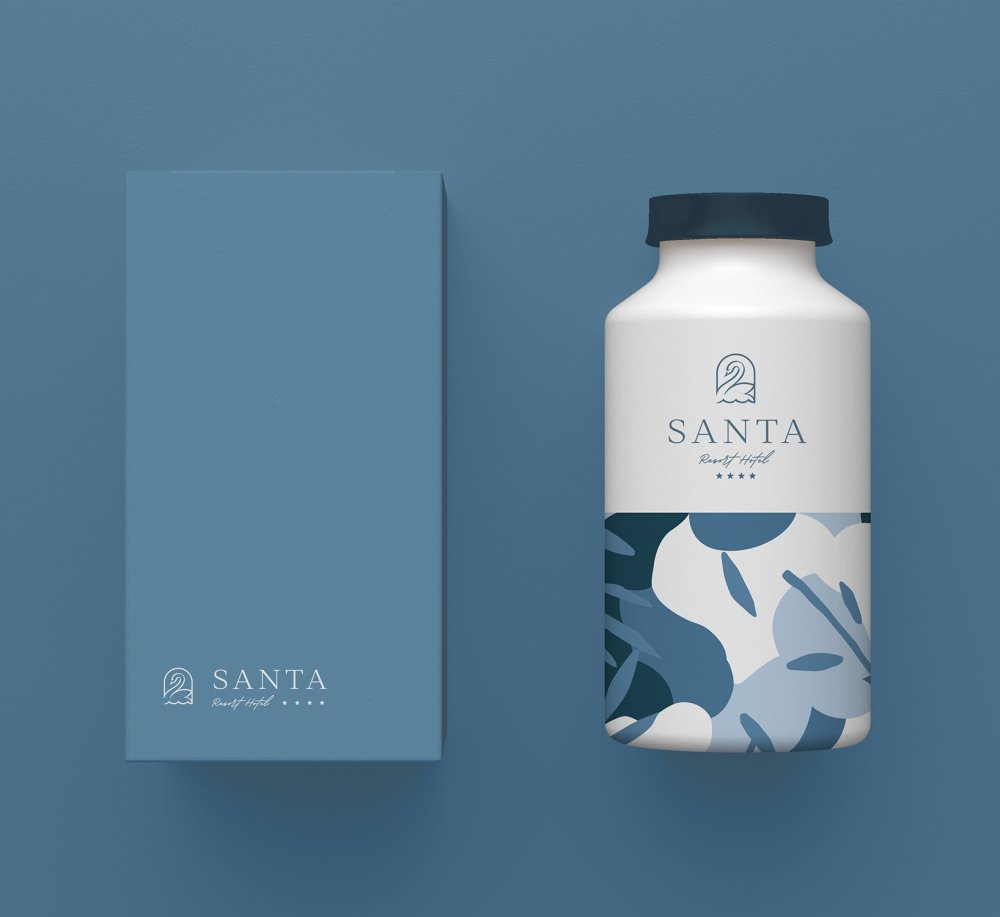




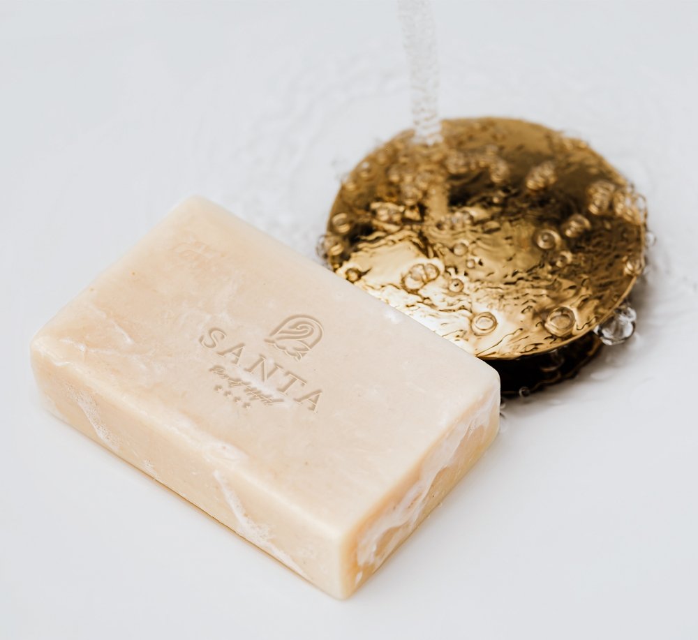
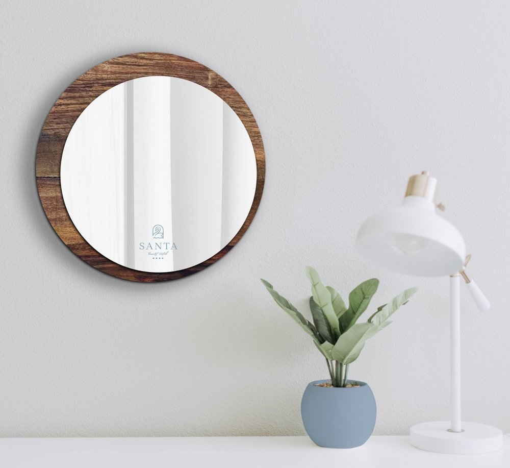
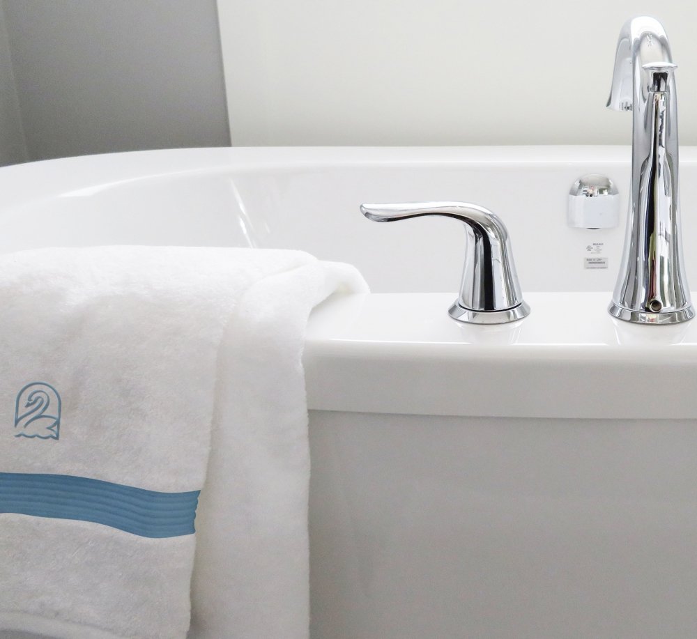
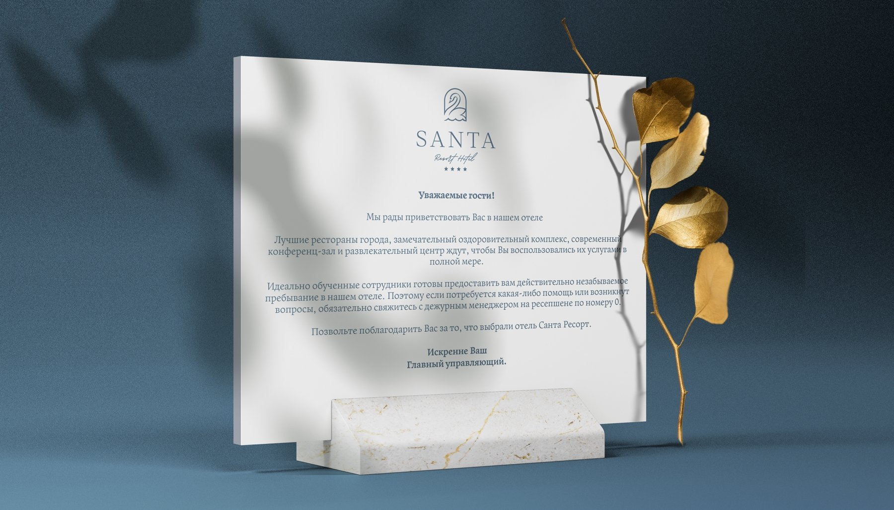
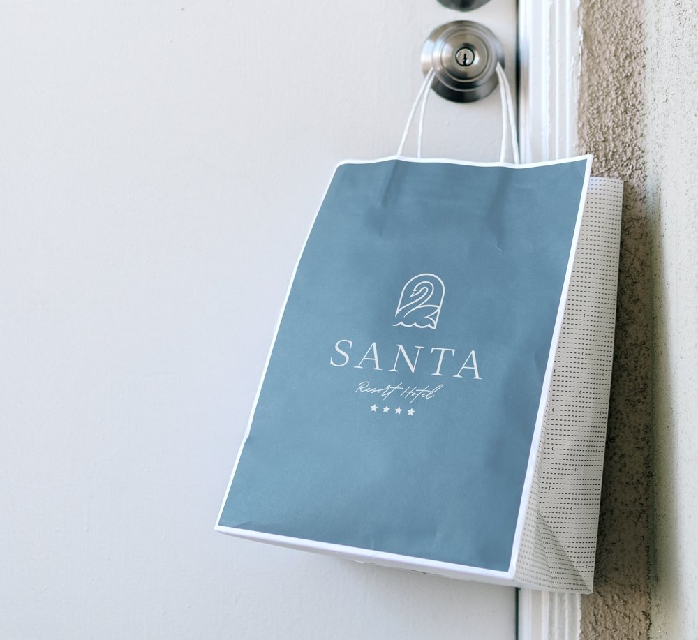

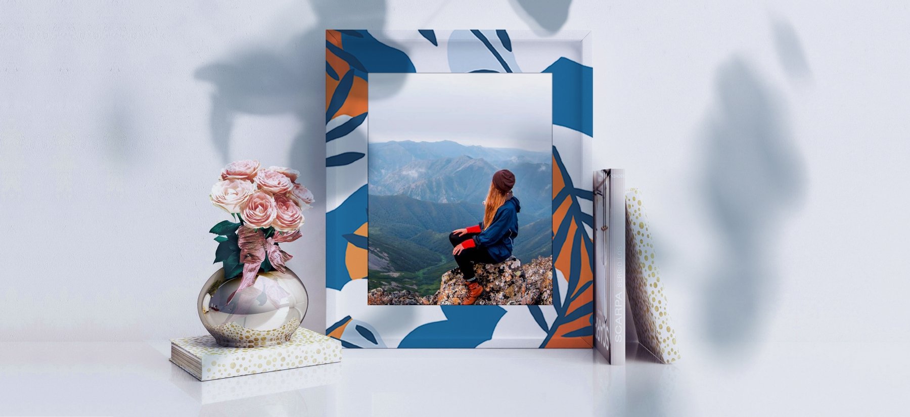
The renovated SANTA Resort Hotel has prepared for you delicious breakfasts, fresh sheets and bright impressions!
