Beauty Symphony

01 Rebranding
Simfonia Krasoty (Beauty Symphony) is a chain store involved in selling professional cosmetics and accessories.
It includes more than ten shops in different cities of Russia. In addition, the company has plans to commercialize cosmetics under its own trademark in the nearest future.
The clients of the company are first of all professionals in the beauty industry: salons, studios or private masters. And they are not the only ones. Enthusiastic customers, who have a careful and thoughtful approach to the choice of cosmetics, also like coming to Simfonia (Symphony).
So our task was to visually update the brand glorifying beauty.
Working with the logo and visual identity, we suggested several concepts, stylistically and ideologically different from each other.
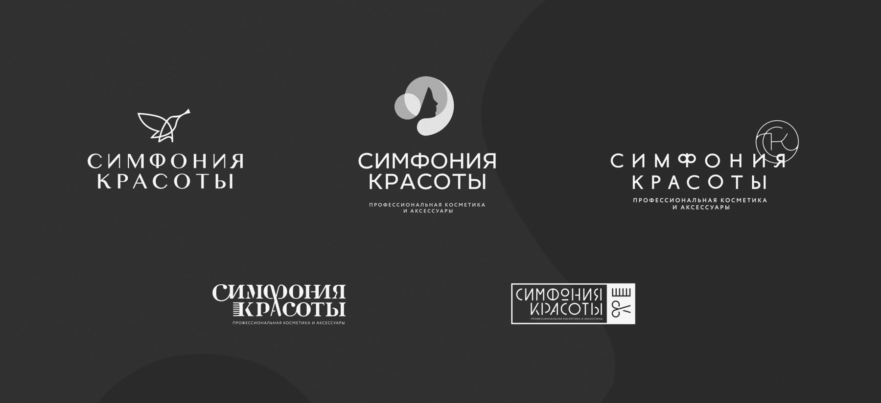
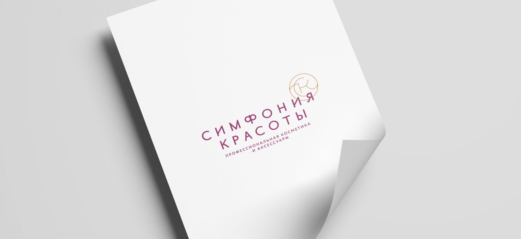
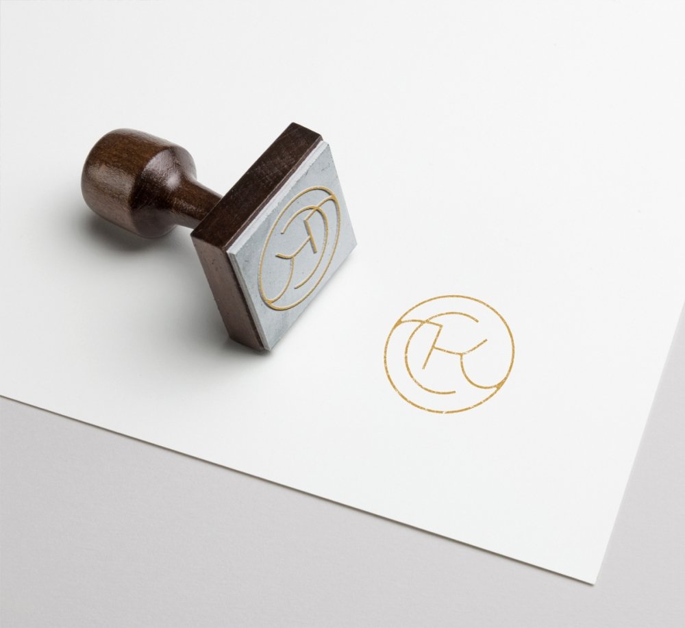
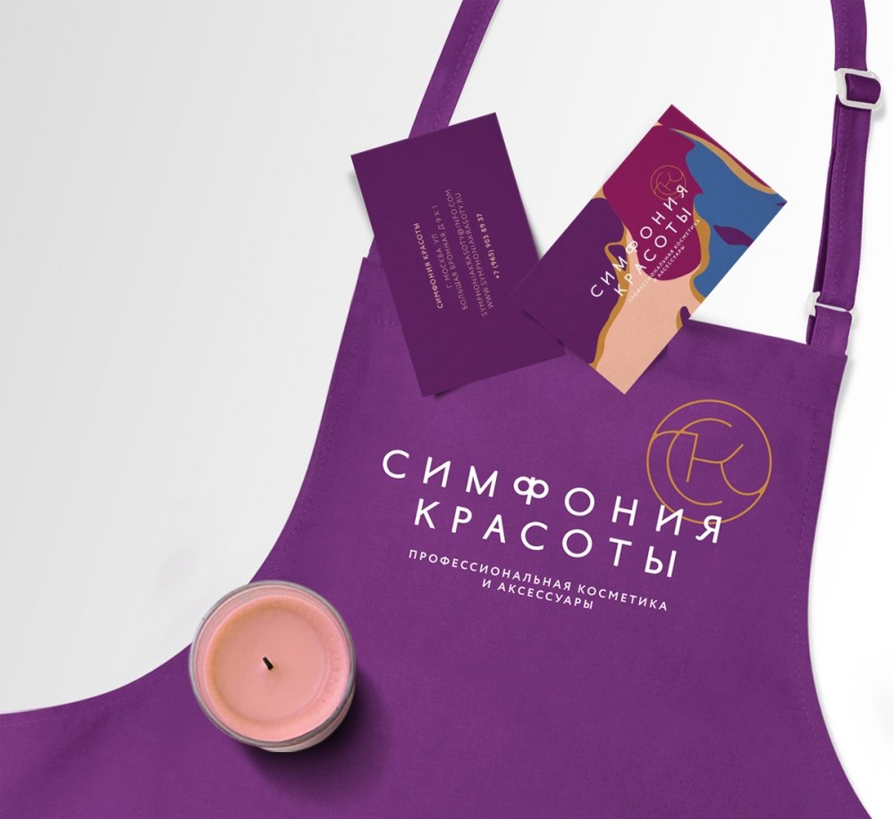
The chosen option is a combination of minimalistic typography and the abbreviation CK, made as a golden emblem.
02 Brand Graphics
The logo was developed together with the concept of color composition and pattern. As the brand graphics, we offered several color compositions to choose from.
Our task was not to evoke association with the natural ingredients. On the contrary, we wanted to show bold, diverse colors, like the company's products, at the same time maintaining a sense of style and harmony.



03 Brand Colors and Font
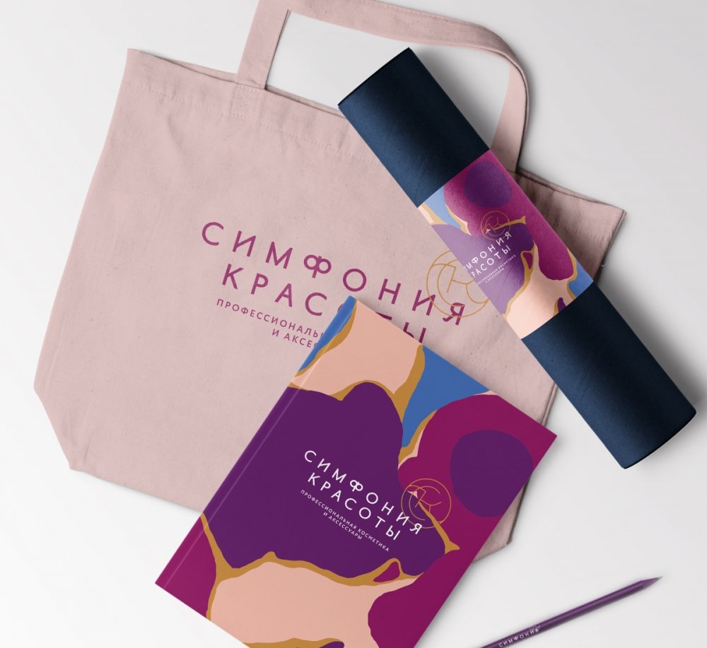
The chosen version of brand graphics consists of five colors. The combination of different colors of the pattern shows a huge range of solutions offered by the company.
Bright and juicy colors, against the background of the usual signs, will attract the attention of shopping center visitors.
04 Visual identity
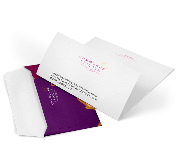
Visual identity is perfectly suitable for different formats and media. Colors are appropriate both for packaging and for corporate documents.
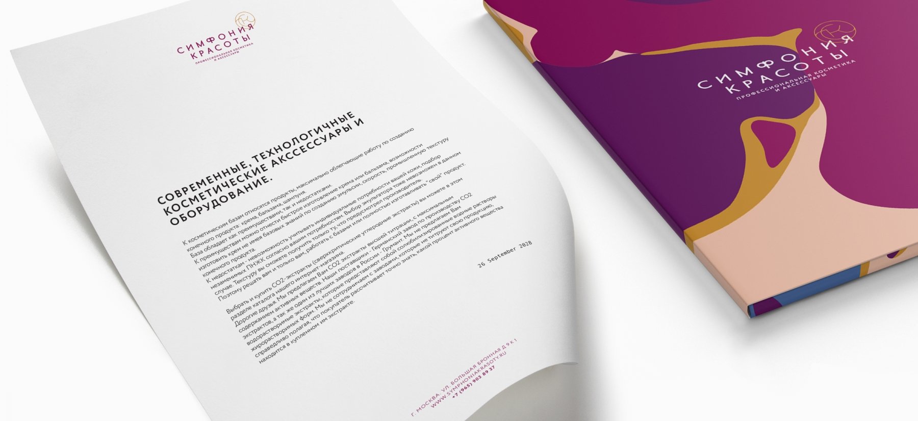
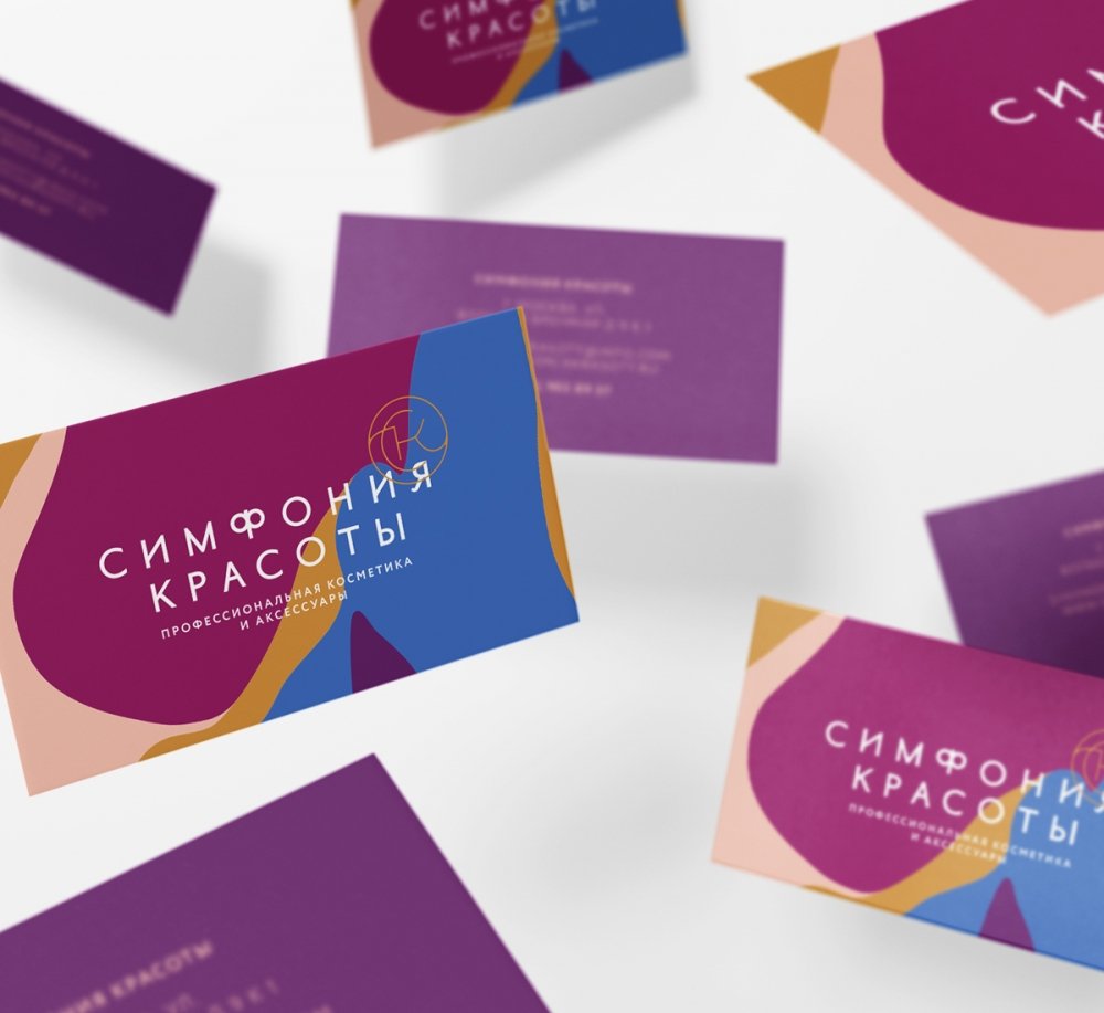
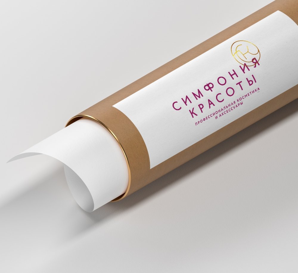
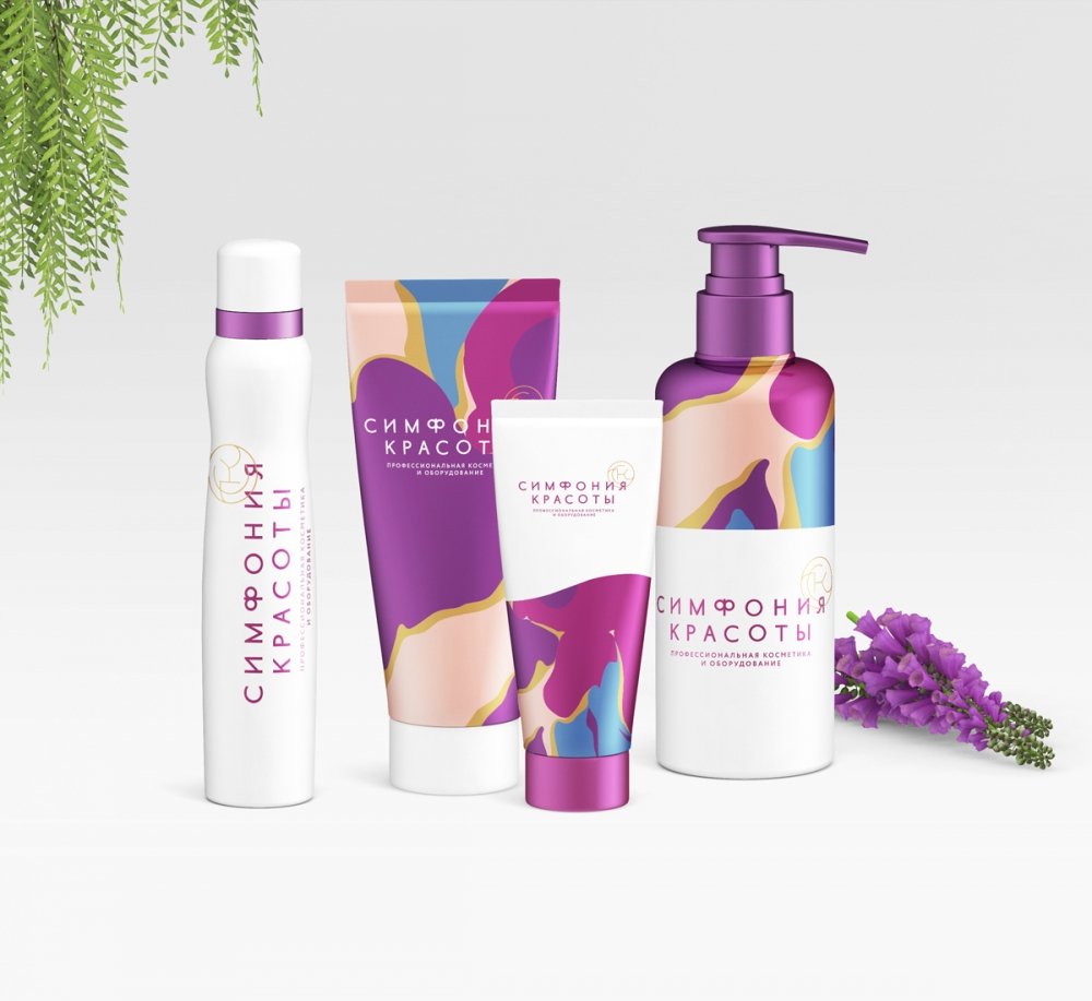
Shopping premises were re-designed by the Customer in accordance with the new style. We can assure you that the brand has changed for its customers. It became even more attractive for both current and potential Customers.
05 Client's Review

Maria
Business Development Manager
The GreenMars team carried out the restyling for our company. This is a very difficult process, as it is complicated to move away from the habitual corporate style and to fall in love with a new one instead. Thanks to GreenMars for a thorough and integrated approach. We are totally satisfied with the results of work!
15.05.2018