LaserWoods
01 Naming
We were approached by a company specializing in figured laser cutting of different types of wood, cutting out and producing wooden decorative elements of the interiors, various components, accessories and different sets for artistic and applied creativity. The founders of the company had a clear understanding that in order to stand out in a highly competitive laser cutting market, it was necessary to develop a strong system of verbal and visual communication.
We started our work with the development of a memorable, euphonious and associative brand name. This name was LaserWoods. Laser technology of wood processing is initially laid down in the English name, which will be easily understood by potential partners and Customers.
02 Logotype
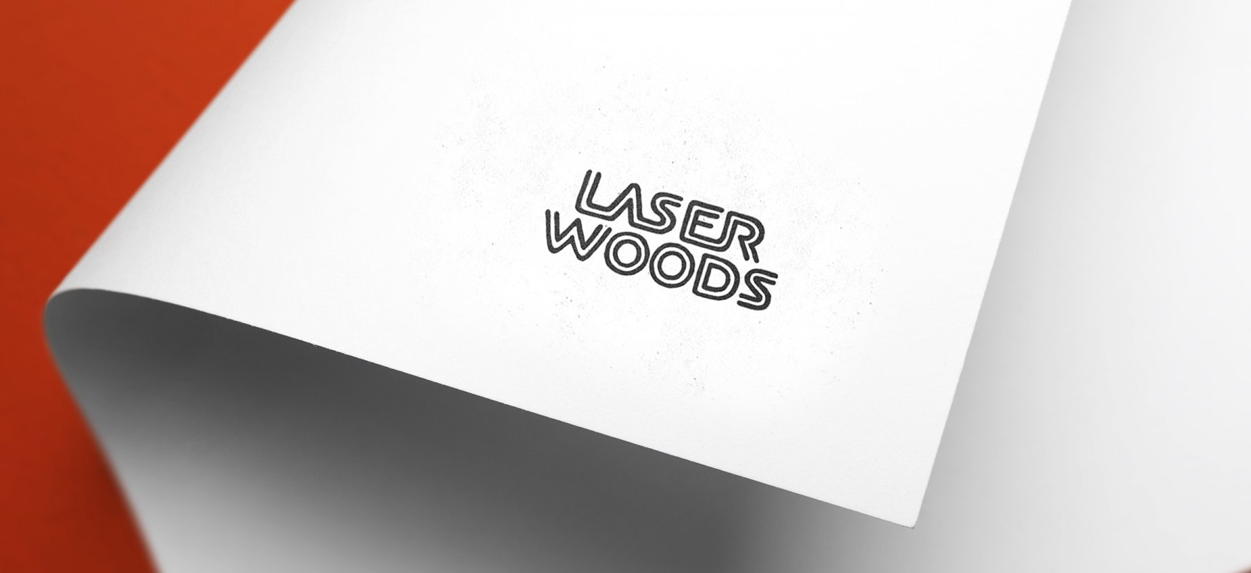
Wood, laser cutting and a short memorable name constitute a favorable basis for creating a visual image of the brand. We have developed several different concepts.
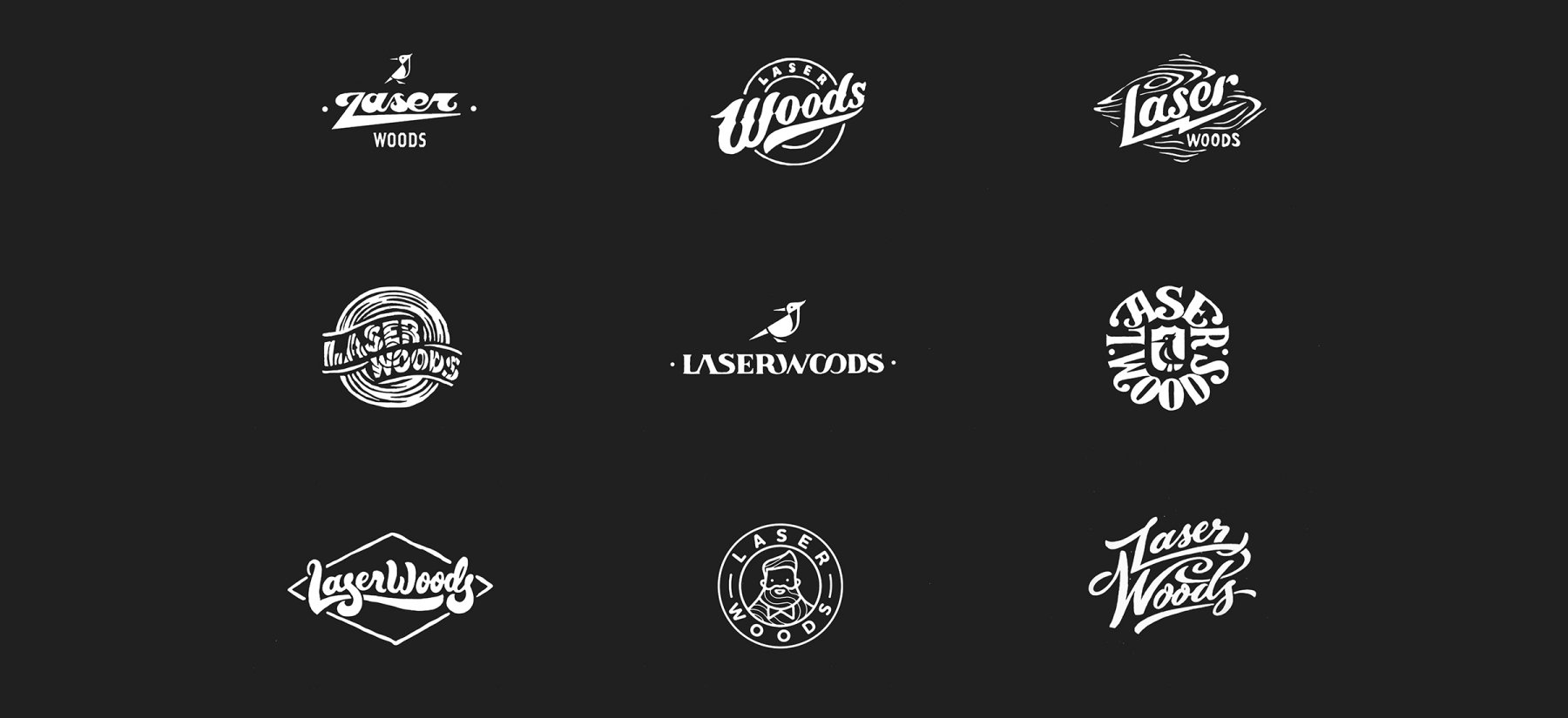
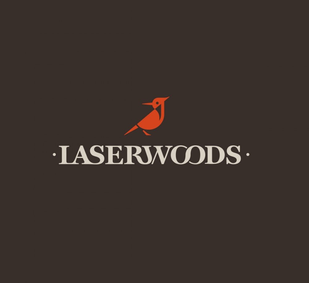
The final variant that was chosen is a logo with a mascot woodpecker. The character instantly associates with woodwork, and the filigree of simple geometric shapes emphasizes the precision of laser cutting.
03 Colors and Font
04 Corporate Identity
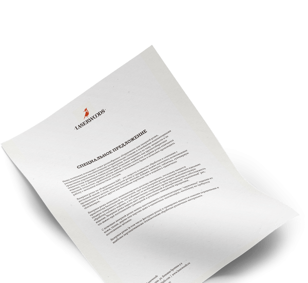
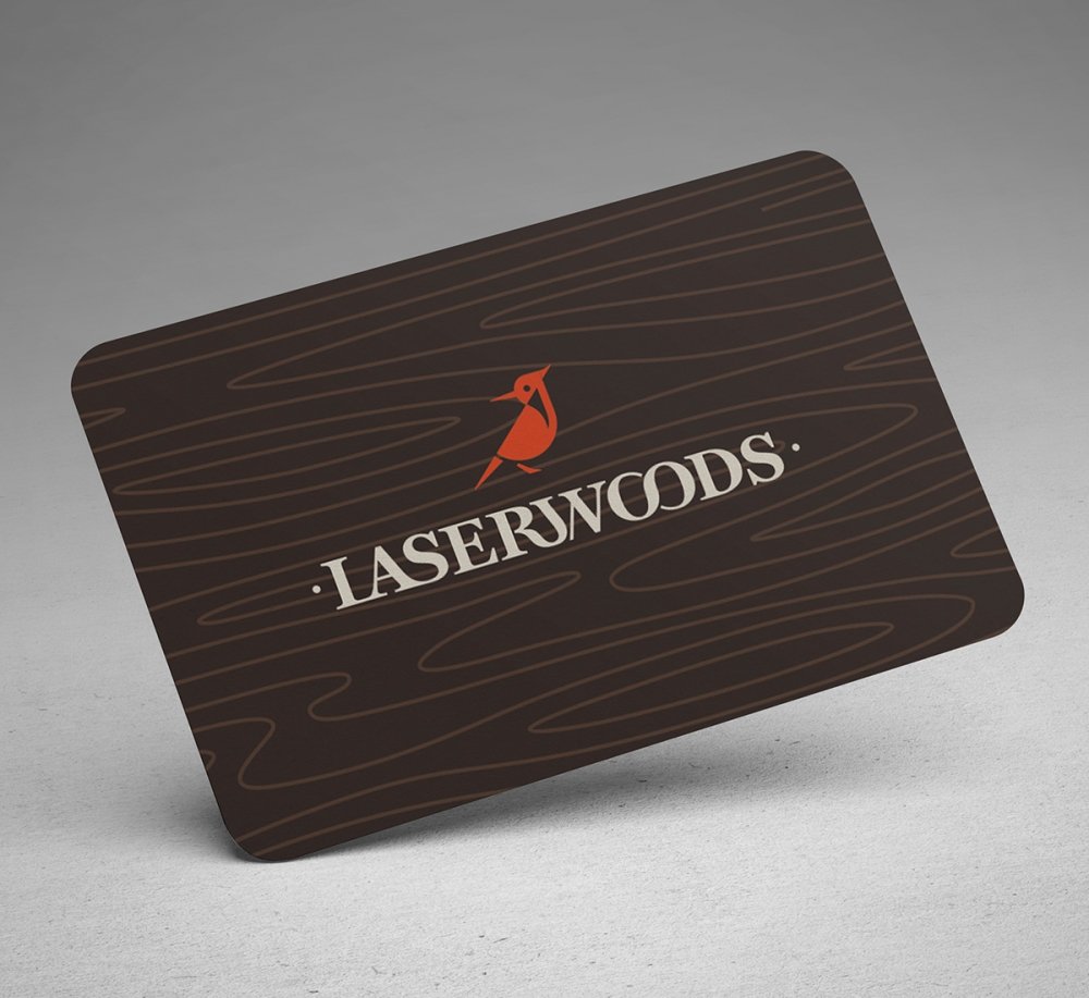
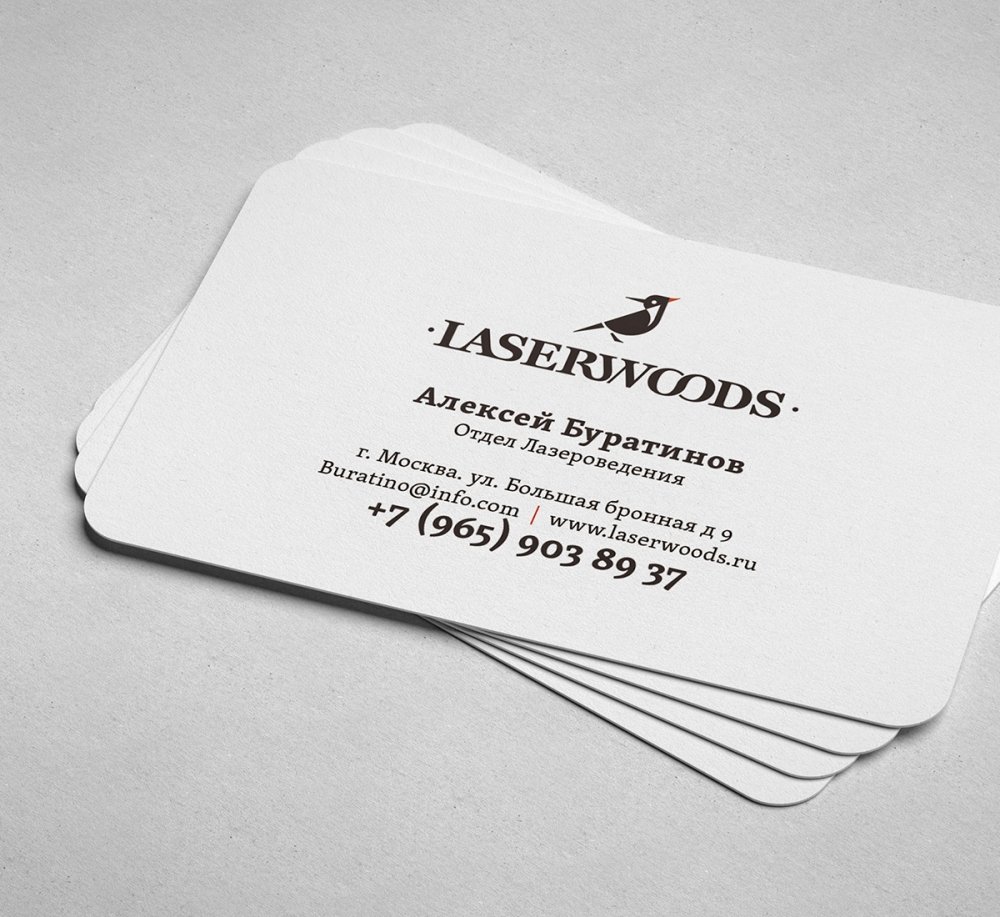
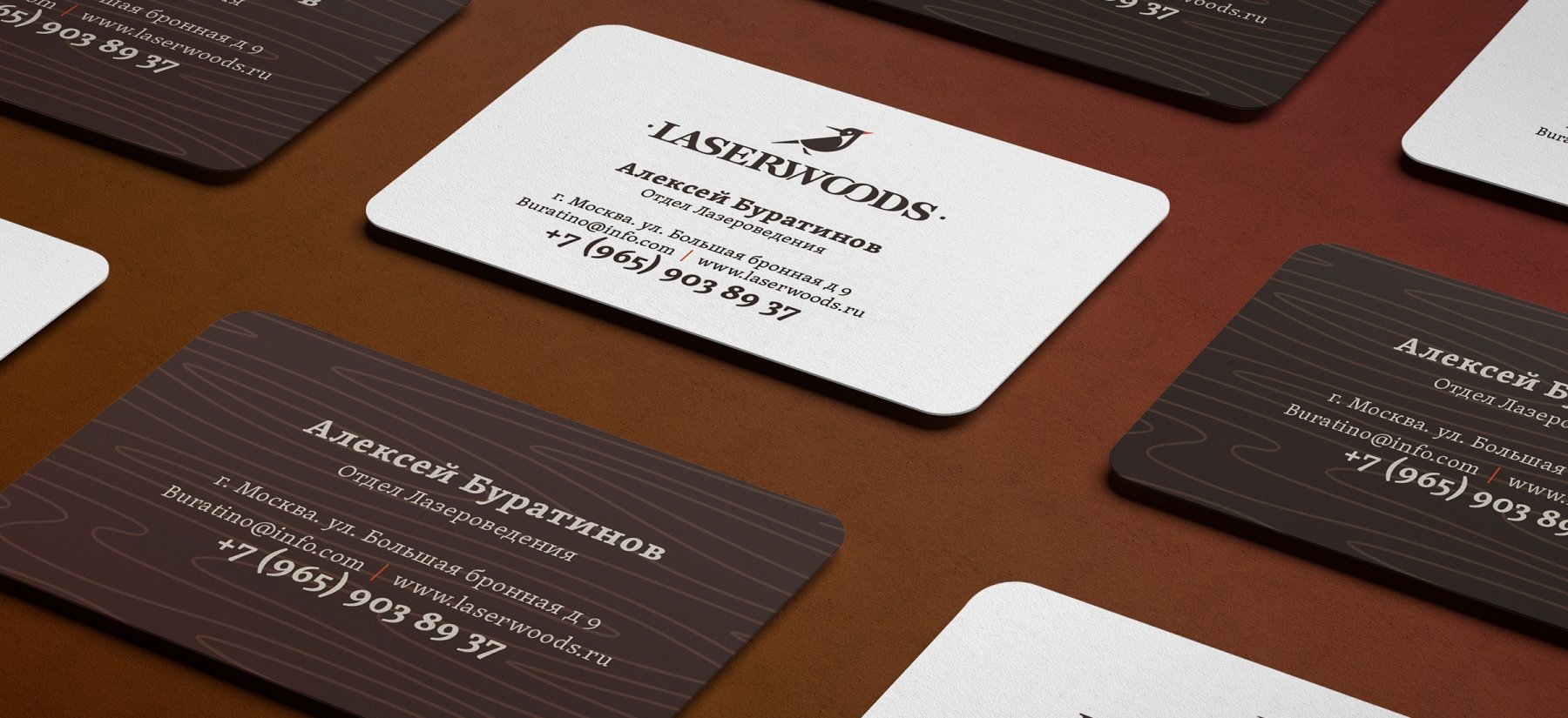
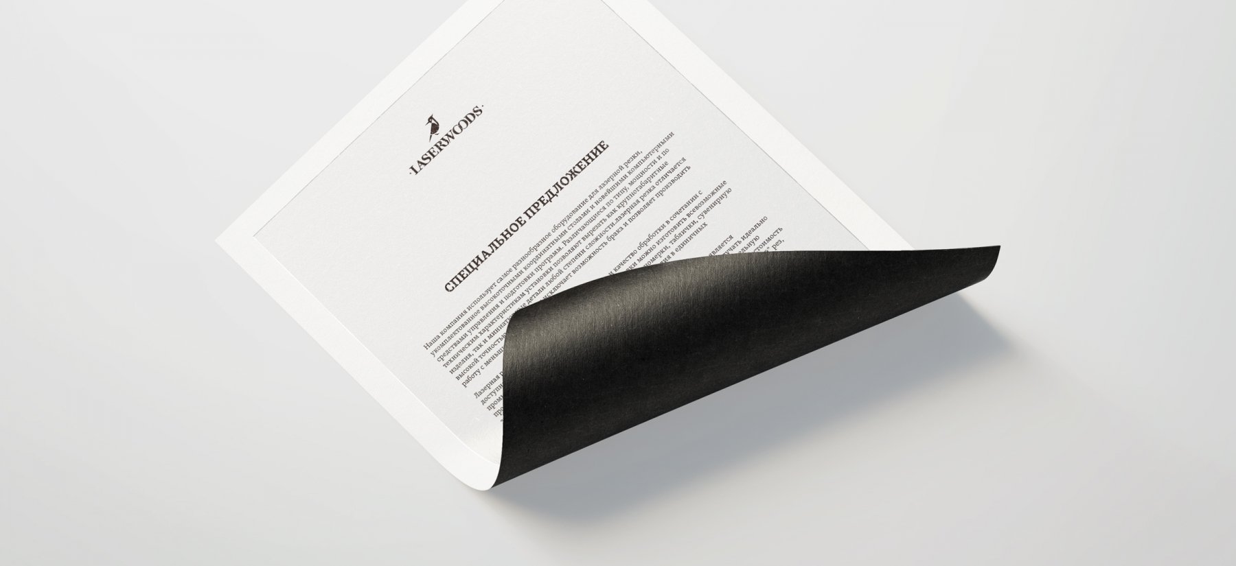
The logo looks effectively on any surfaces, including wooden ones. LaserWoods business cards and the company forms are characterized by minimalism and simplicity of shapes. Laconic classical style is meant to emphasize the professionalism and perfect skills of company's employees.
05 Client's Review

Yaroslav Egorov
CEO
GreenMars creative agency was the starting point for the development of our business. Thanks to the team of professionals, the name and corporate style for our company were developed. In the process of common work, the guys from the GreenMars team became real friends for us. We continue our cooperation, and we consider this to be our competitive advantage. Thank You.
23.06.2015