Pianeta

01 Coffee Planet
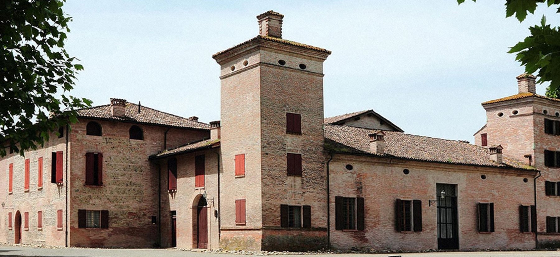
Coffee is a whole world for its connoisseurs. And Italy is, perhaps, the main coffee country. This can be concluded from the manufacturer's plant, located in the Emilia-Romagna region in the northern part of Italy. This factory has been following rich traditions for more than a hundred years. We have developed a brand for a new collection.
02 Naming and Sketches
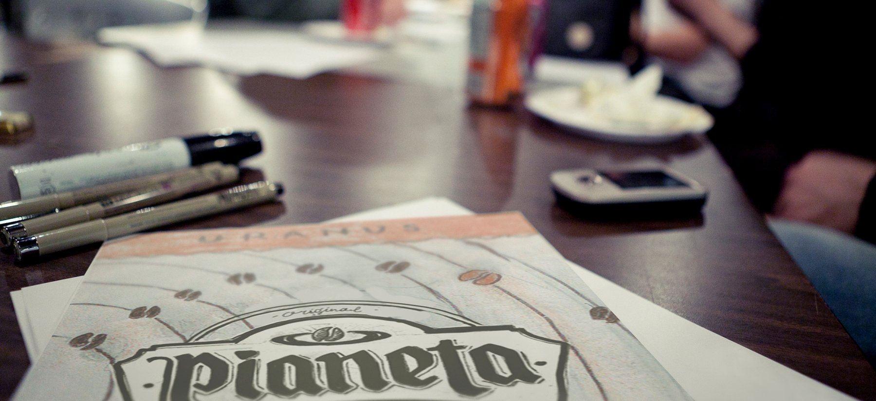
The name Pianeta (Italian - "planet"), that was suggested by us, fully corresponds to the brand positioning. Visually and phonetically it focuses on the country of origin and gives room for further creative solutions.
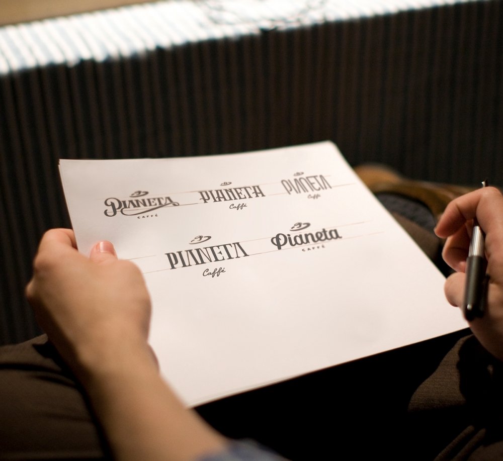
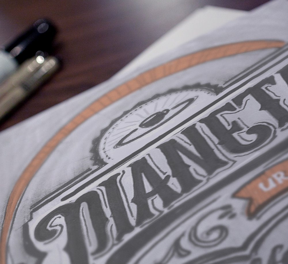
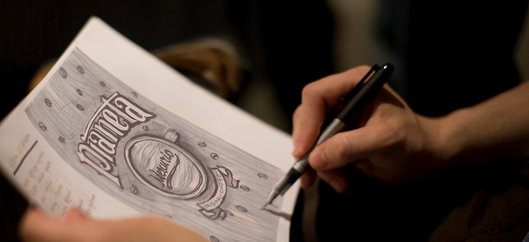
The main ideas for the development of the concept of the logo include its branded typographics and the planetary system.
03 Logo
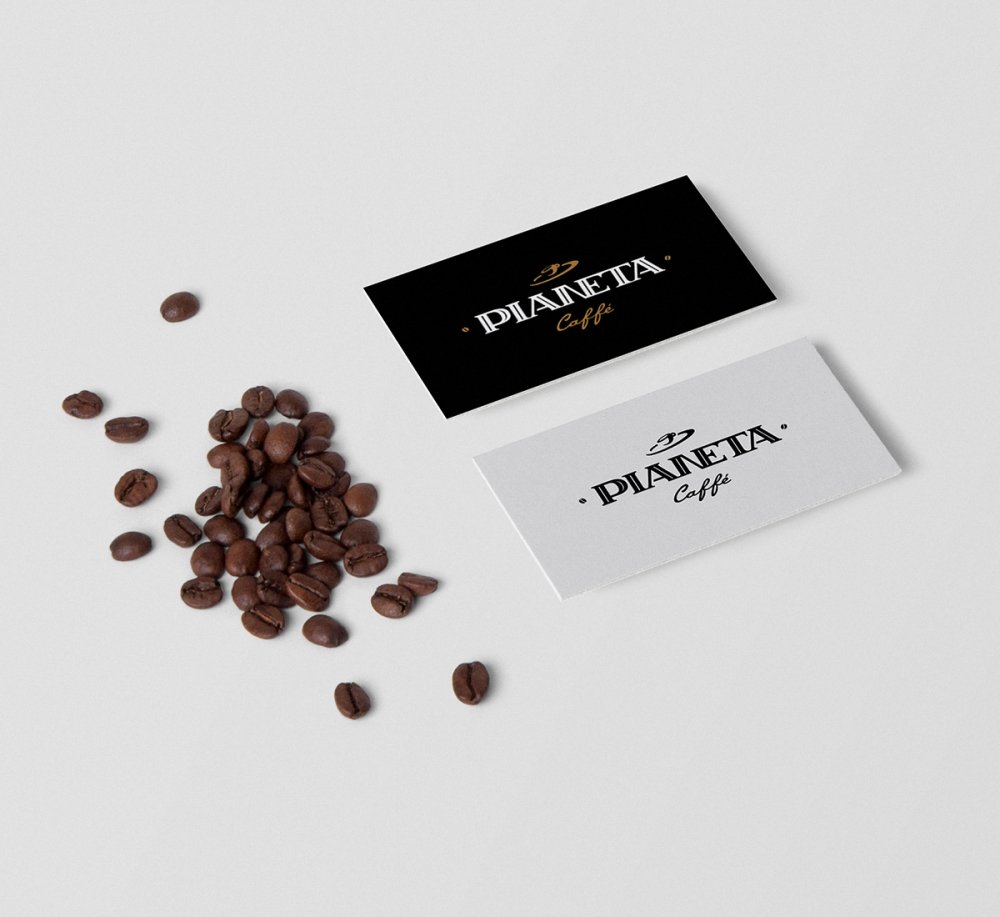
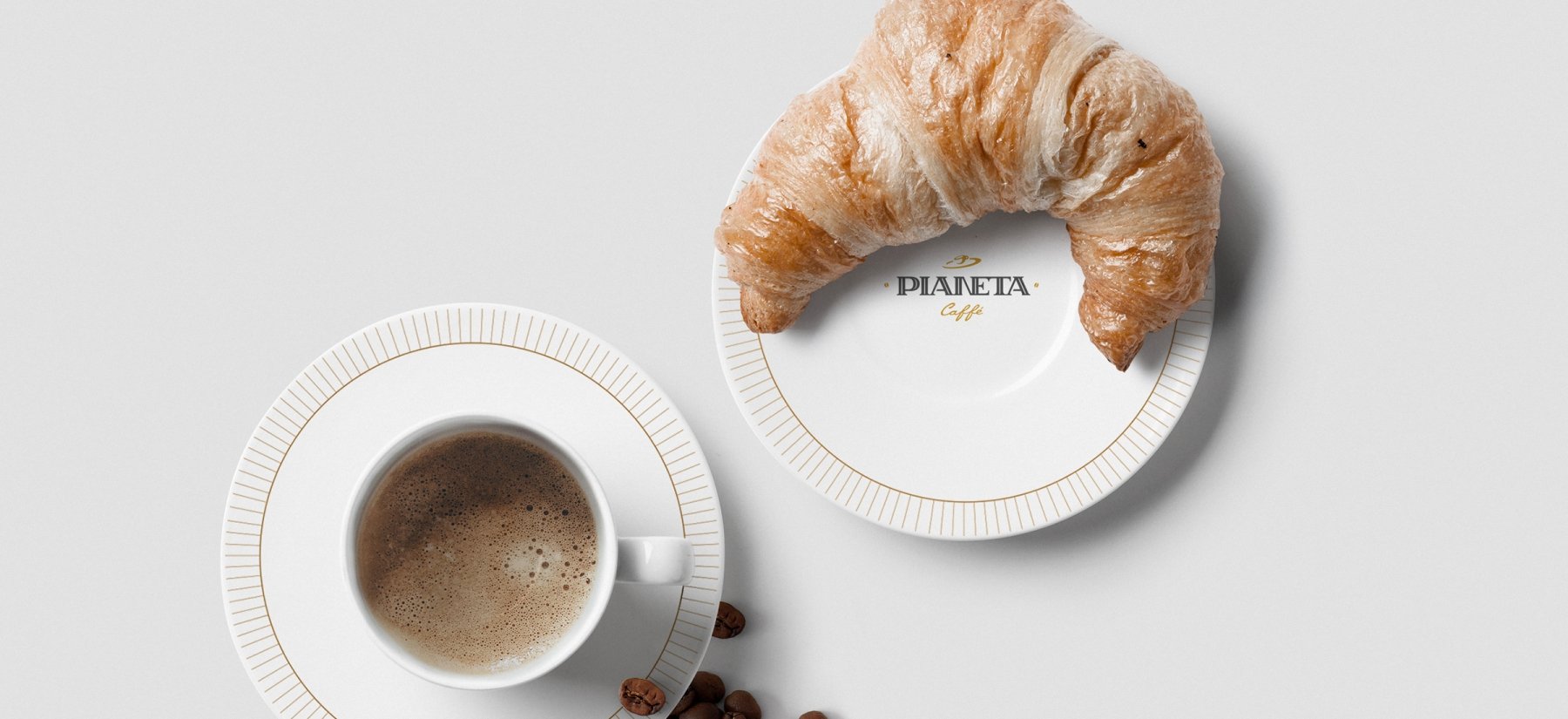
The final version of the logo consists of the system of elements. The lettering of Pianeta is made in the Art Nouveau style. Above the letters, there are a cup and a saucer, associated with a planetary rotation system.
On both sides of the logo there are small coffee beans that frame it. The logo looks impressive on different media both being colorful and monochromatic
04 Names of Coffee Varieties
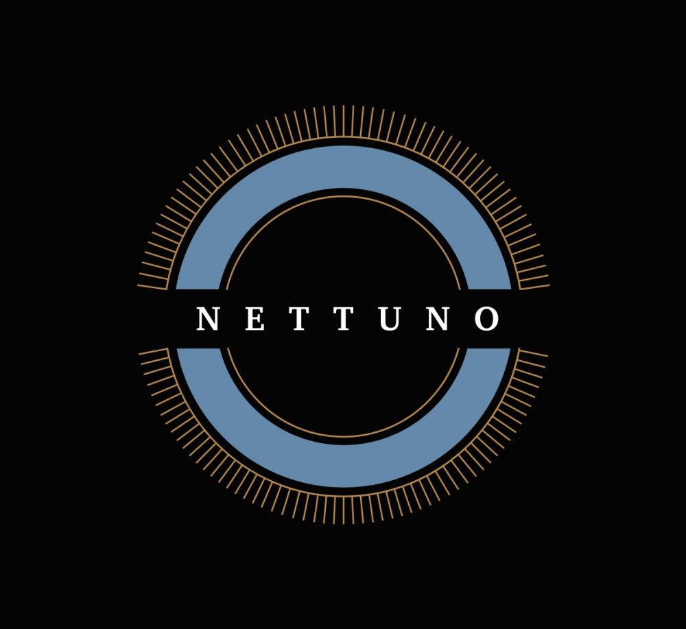
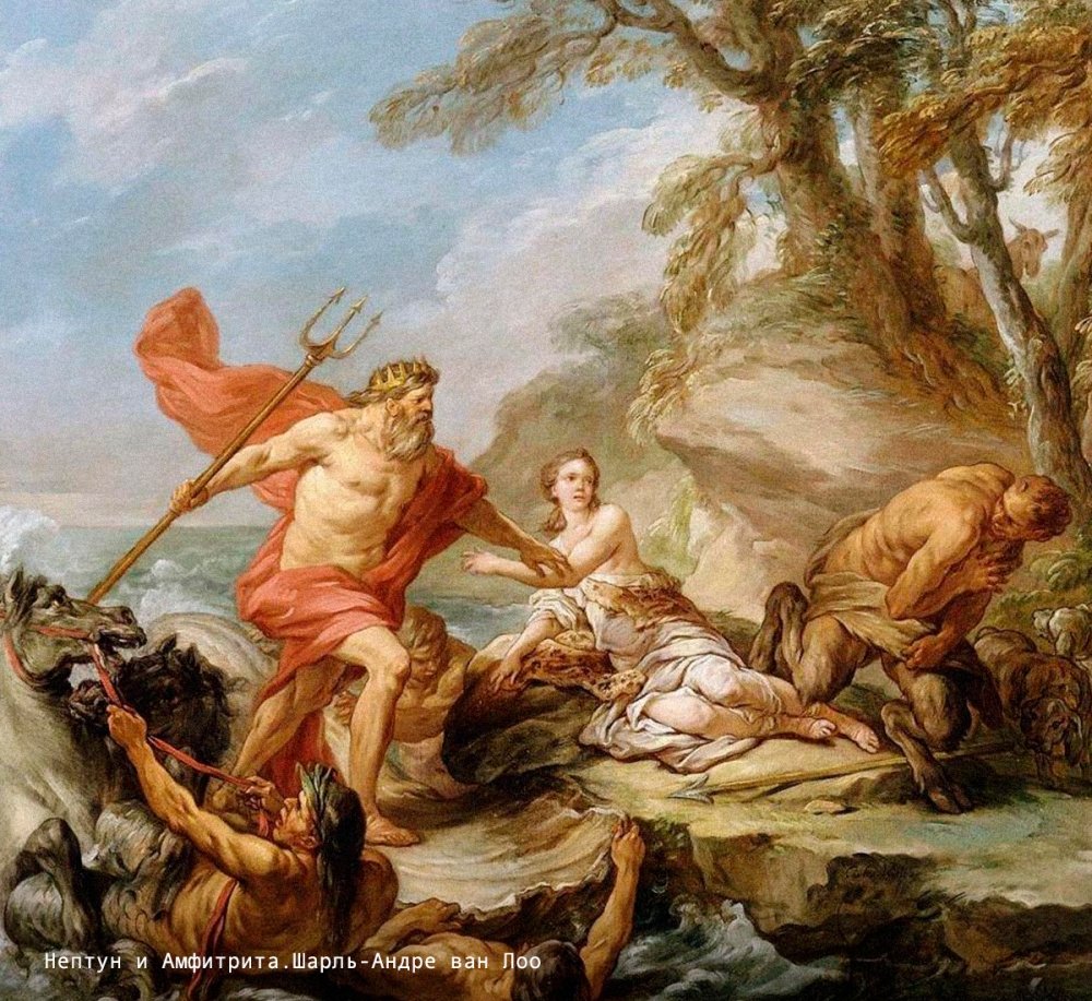
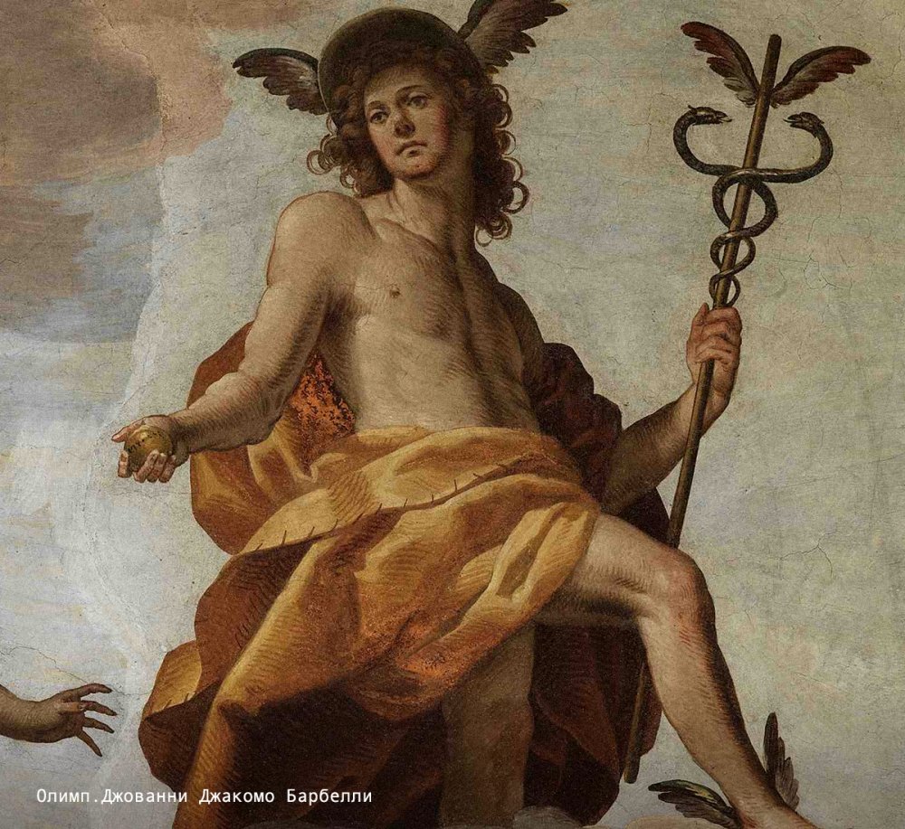
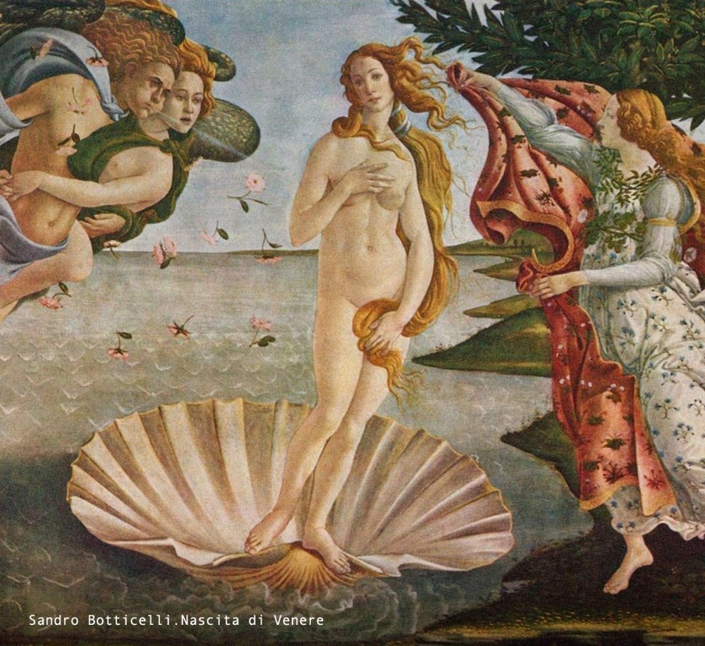
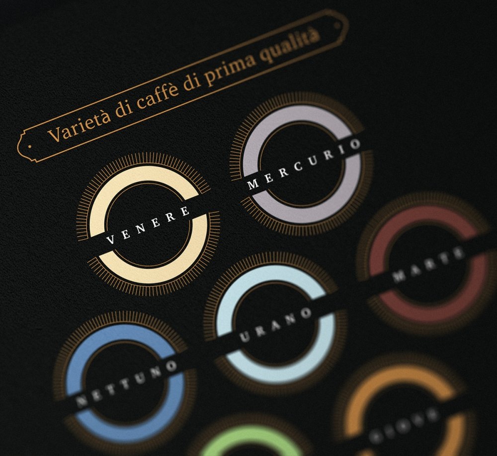
Symbolizing a great journey, the varieties of Pianeta were called in the same way as the planets of the solar system in Italian. Back in the old days ancient Rome gave names to the planets calling them after its gods.
We used this as an additional semantic element, emphasising on the perception of different varieties of Pianeta.
05 Package Design
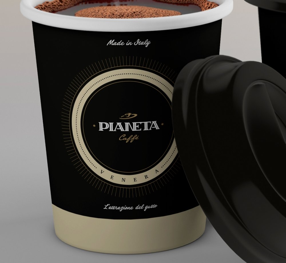
The main color of the brand is black; its combinations with white and bronze colors model the space environment.
The varieties of coffee have their own additional color indication corresponding to the name of the celestial body and to the character of the ancient deity.
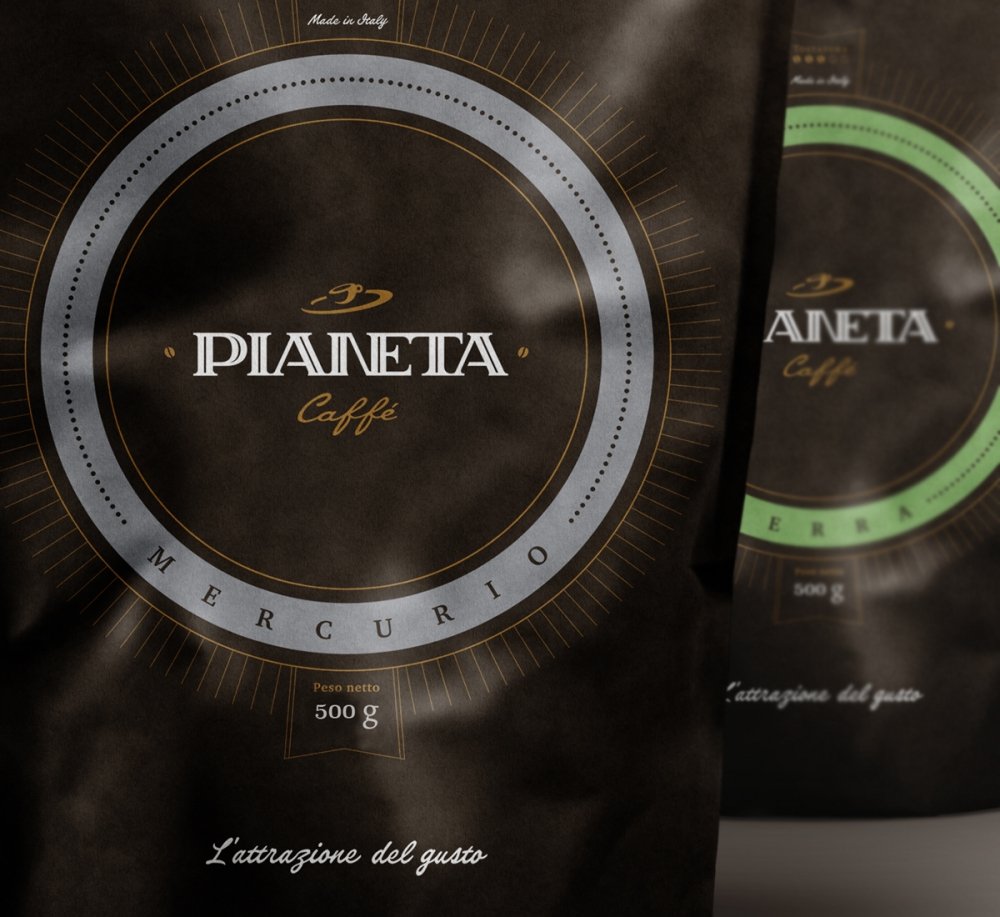
As we know from the course of physics (remember the case with Newton, when an apple fell on his head?), every planet in the universe has the attraction force or gravity. Therefore, for the brand, we suggested and approved the following slogan: L'attrazione del gusto (Italian – Gravitation of Taste)
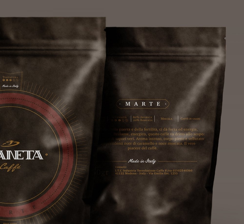
For each variety we have developed the description in Italian.
For example:
Marte, un dio della guerra e della fertilità, ci dà forza ed energia, fiducia di se stesso. Brillante, energico, questo caffè va dritto allo scopo: un contrappunto di sapori veri. Aroma intenso, corpo pieno e vellutato con le sorprendenti note di caramello e noce muscata. Il vero piacere del caffè.
Translation into English: Mars, the god of war and fertility, gives strength, energy and confidence. Being bright and energetic, this coffee helps you to achieve different goals, offering the variety of genuine tastes. Rich aroma, silky base notes with the unexpected shades of caramel and nutmeg tastes bring you a real pleasure from coffee.
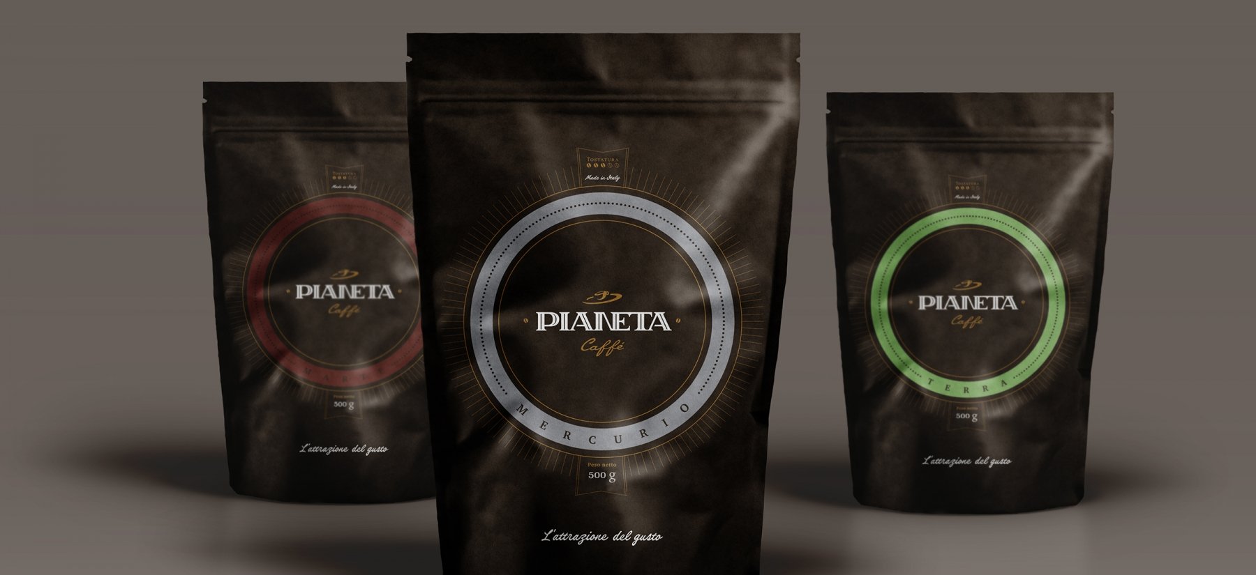
Combining majesty and minimalism, branding of Pianeta coffee focuses the consumer's attention on the main things - the elite heritage and a great taste of the product!
