Bloomio
01 Objective
The agency client is a company specializing in selling cosmetics from Korea, Japan and other Asian countries.
Eastern methods of care combine rich traditions, rare ingredients and latest technologies. We needed to reveal these characteristics in verbal and visual communication.
02 Naming
Flowers constitute an integral part of Korean culture. Many poems and artworks are dedicated to them. They symbolize female beauty and youth. Flowers and herbs form the part of the eastern care products.
In English, "Bloom" means flowering, blush. We added a soft ending "-io" to the word which provides its own identity and recognizability.
03 Logotype Concepts
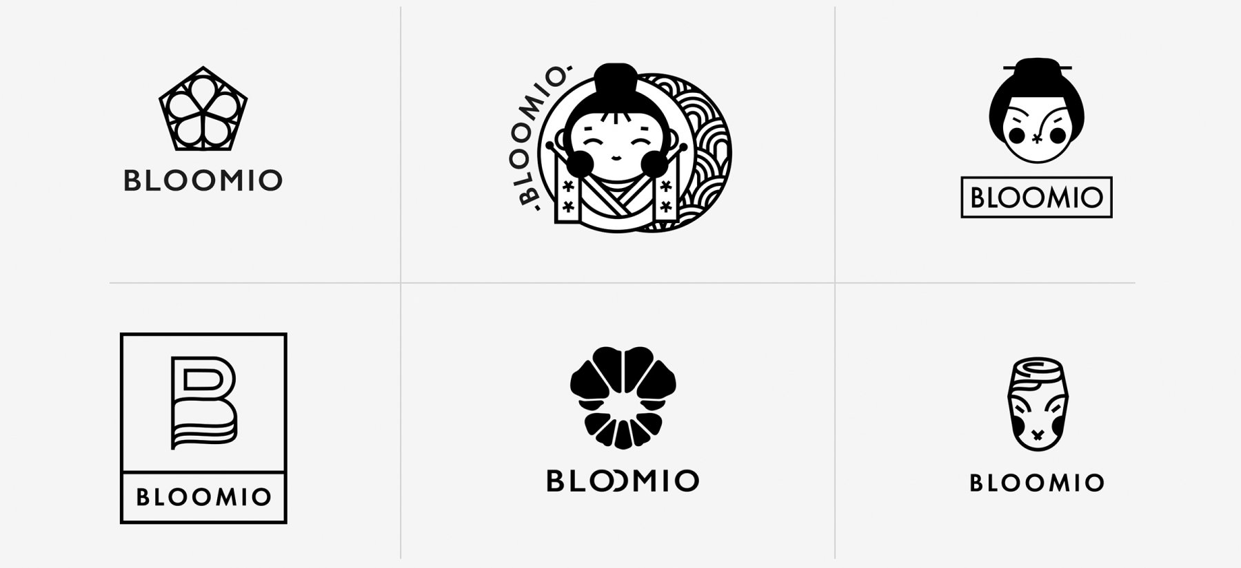
Concepts suggested by us develop the idea of flowering beauty.
04 Logo and Visual Identity
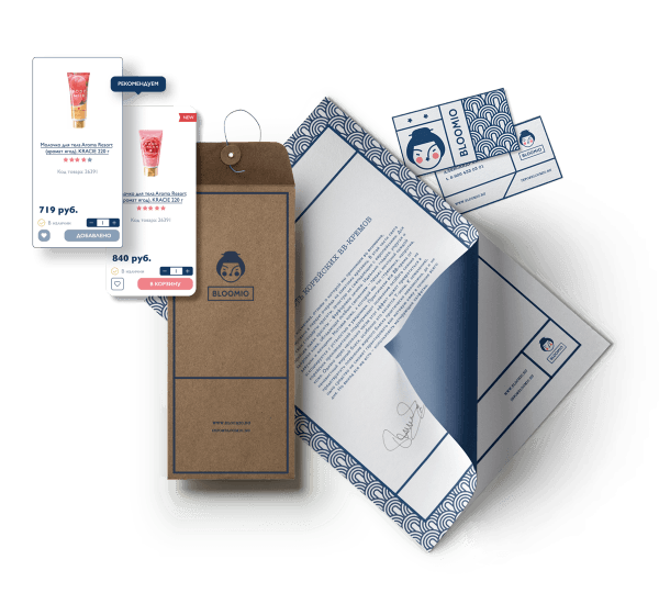
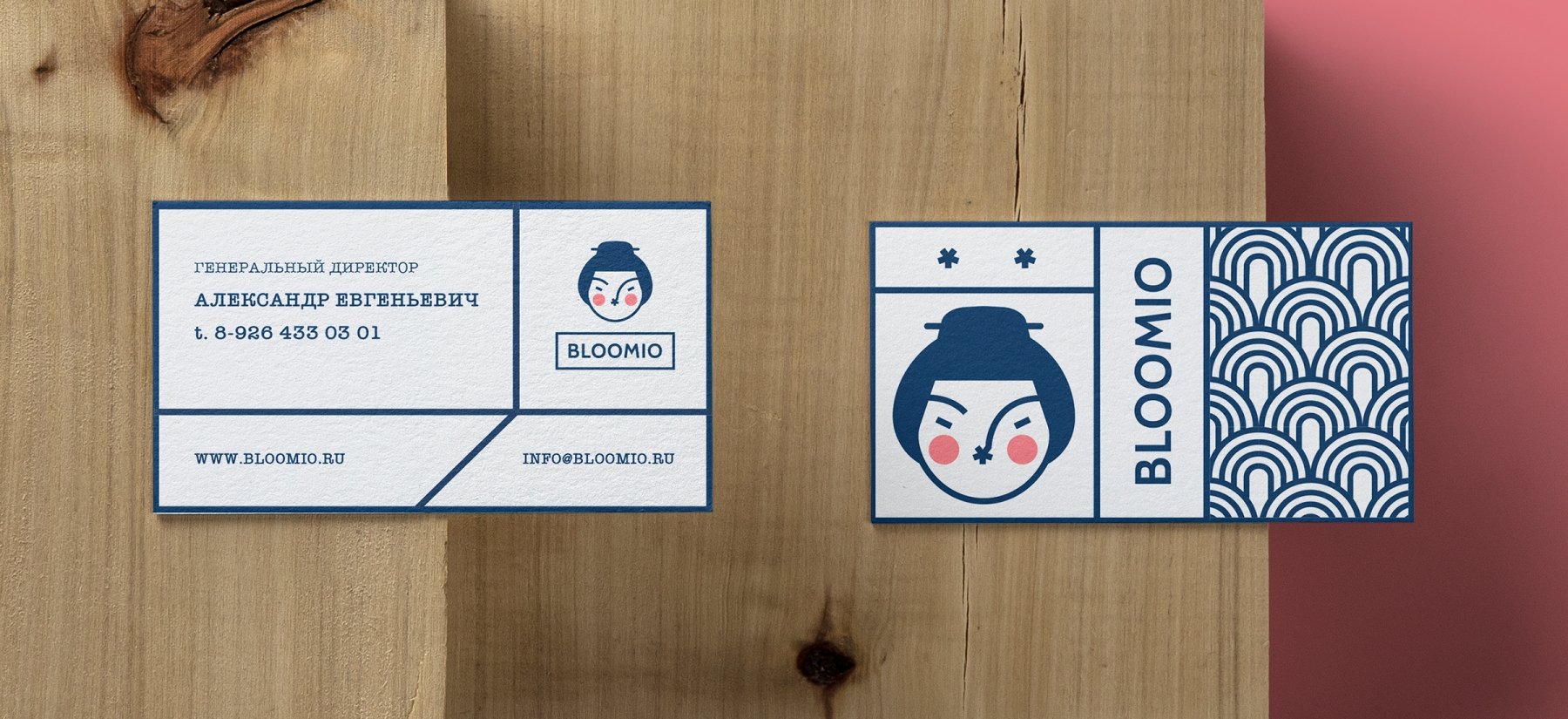
The chosen variant of the trademark is a combination of elegant face lines of a young Asian girl and the light font.
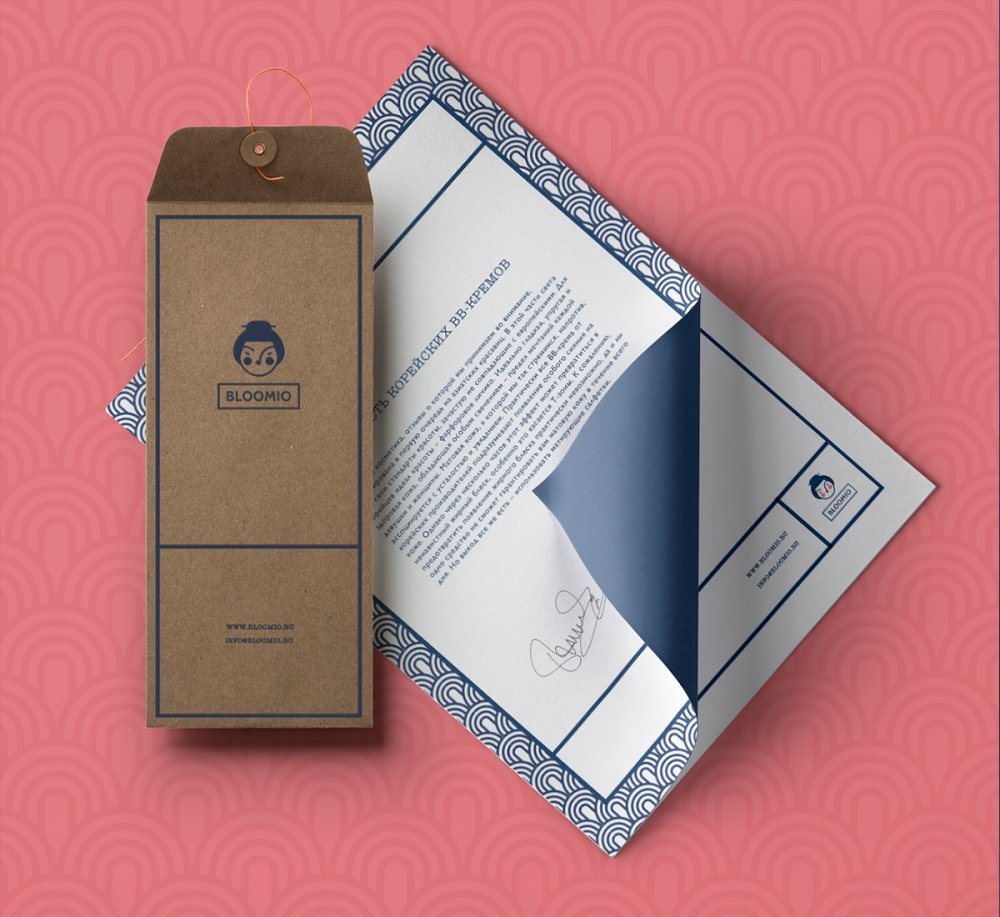
Corporate colors include blue shades of the eastern seas and pink tenderness of the petals. An additional style-building element is a pattern inspired by classical Korean ornament.
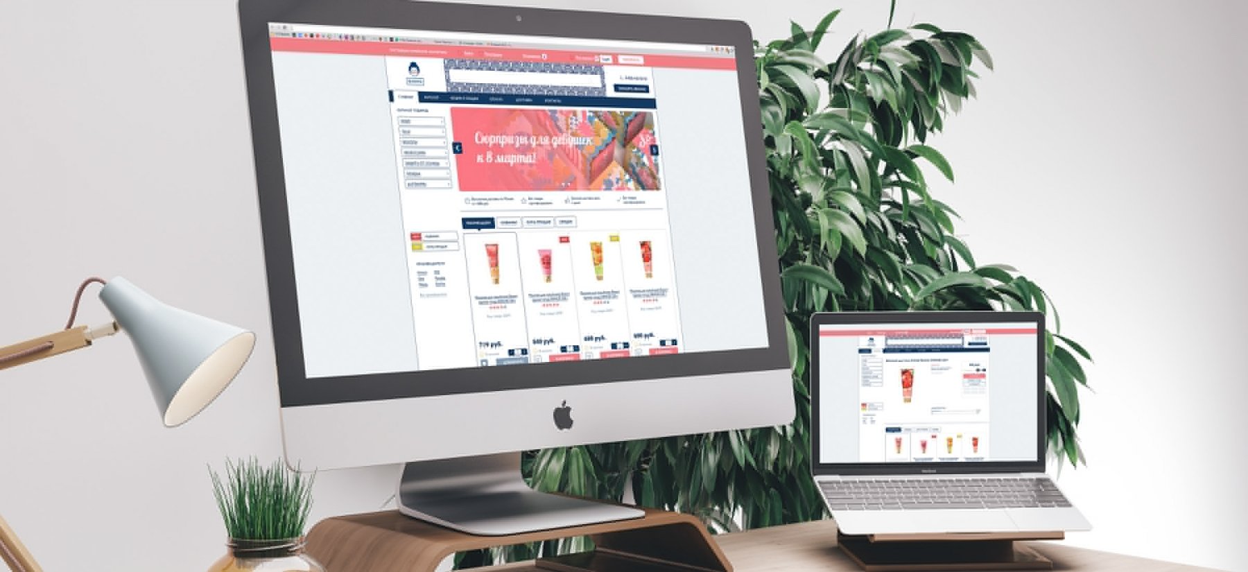
05 Visual Identity on the Website
We made the design of the company's online store correspond to the corporate identity. Navigation elements, text and title fonts form a logical continuation of the developed system of visual communication.
