Opticum


01 Objective
Our client is an existing network of optics salons. The management made a strategic decision to launch a new format brand. It presupposes the use of the latest computerized modeling technologies in the selection of frames, vision diagnostics and eye health.
Its target audience is constituted by modern men and women of all ages who have the active lifestyle. They have the sense of taste; they value their time and health. In verbal and visual communication, we needed to emphasize the company's innovativeness and to reflect the metaphor of superb vision.
02 Naming
We offered more than ten variants of the company name. The choice of the client fell on the name "Opticum" (Оптикум). The title has several associations and meanings. First, it is a direct association with optics. Secondly, the name is created based on the principle of the Latin word-formation (the ending -um is used for the nouns and adjectives of neuter gender). And Latin, in its turn, is the language of exact sciences. Thirdly, the combination of "optic + um" alludes to the high degree of intellectuality of the proposed solutions.
03 Logotype
We offered several ideas as the concepts of the logo. They are all based on optical effects and the nature of light perception.
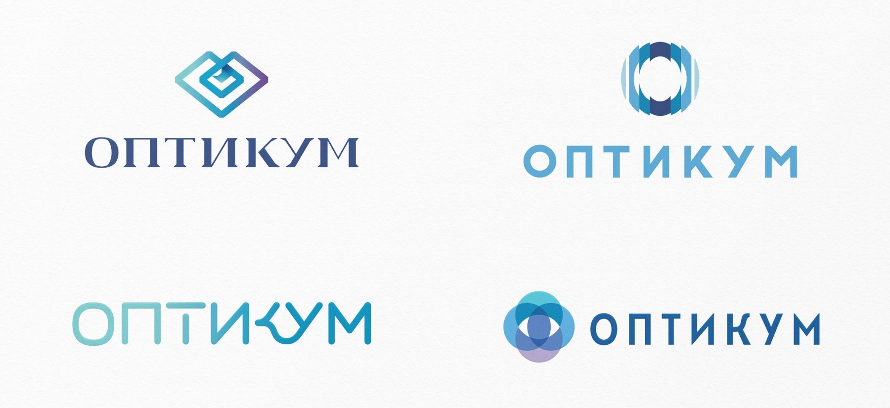
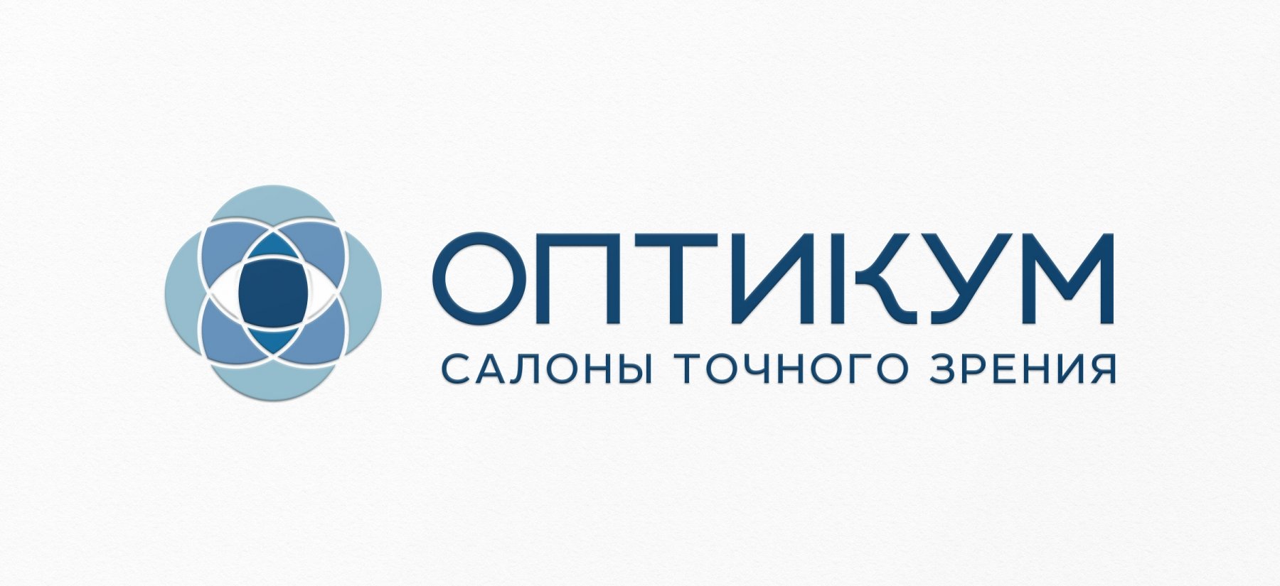
The graphic sign of the selected logo includes four crossed lenses forming a clear outline of the eye. It symbolizes the technology in the selection of lenses and clear eyesight, as a result of it. The clear and round typography used in the logo is a natural continuation of the sign.
04 Colors and Font
05 Corporate identity
Corporate identity is designed in blue colors. Naturally, people associate these shades with light. Clear blue sky, turquoise sea, dark blue night, cold ice have been familiar to us since childhood therefore these images form this type of perception. On the other hand, blue is the color associated with high technology and with the future.
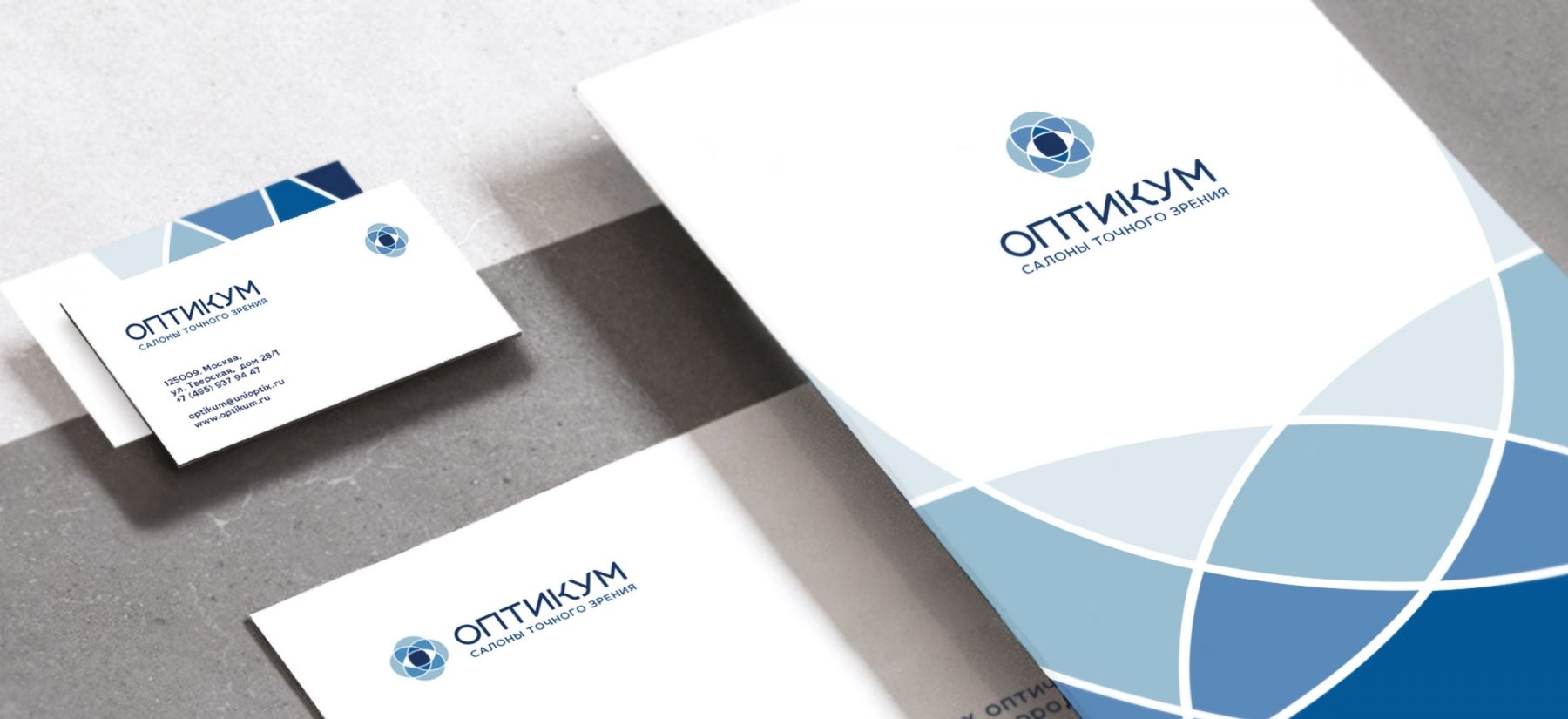
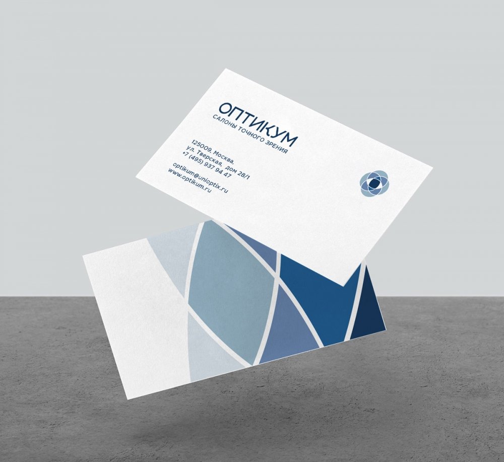
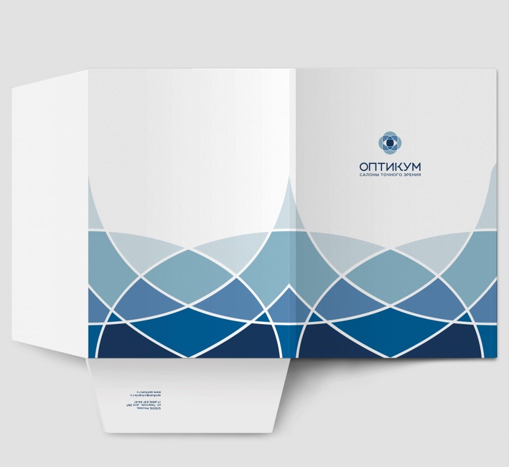
The corporate pattern continues the idea of intersections and resembles a kaleidoscope, an optical device with an infinite set of crystal patterns. Opticum (Оптикум) is similar to this toy by its wide choice and the simplicity of shopping process.
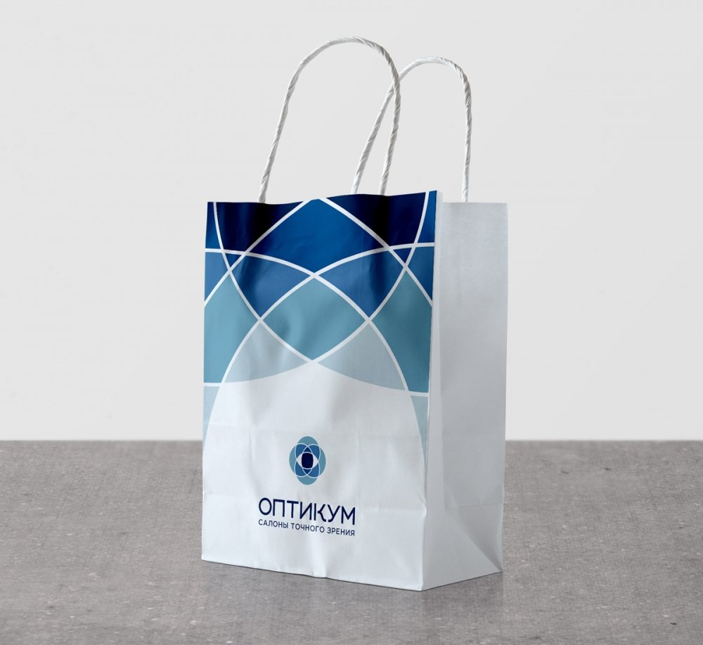
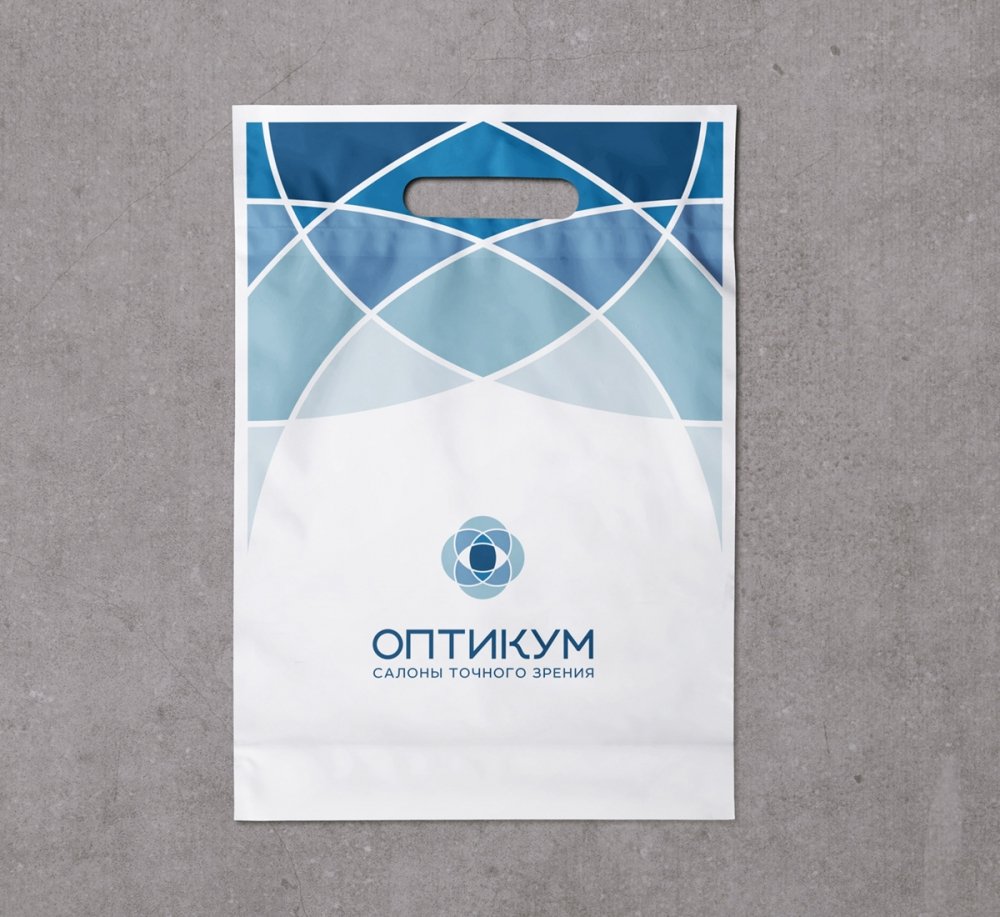
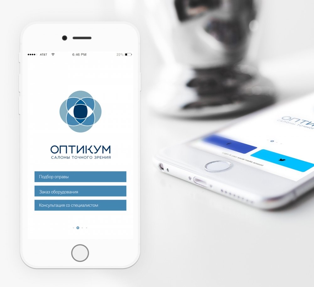
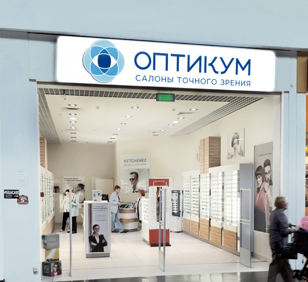
The logo looks equally impressive both on print media, in digital formats, and in Opticum retail premises decoration. Visiting these premises, you can be sure that its professionals will take proper care of your vision.
